Saturday, December 29, 2018

1582 - One Fine Day In Gotham


For some time, I've been doing extensive research on Superman.  This started with my bespoke globe of the planet Krypton (for example, please click here to see JSVB Post #1544), but now I have a broader interest in The Man Of Steel.

The weather has been great lately, so I decided to leave Metropolis and journey across the Bay to sprawling Gotham.  Normally it's stormy and dour over there,  but sometimes you can luck into a crisp, brilliant fall day before thick grey snow chokes the city.  

I took this photo of a statue of Batman brooding atop a cenotaph, which I thought was a little strange since I don't recall ever reading that their City Hall ever laid out funds for such a thing.  I turned away to mention this to my wife, but when I looked back the statue was gone.   


Tuesday, December 25, 2018

1581 - "In Slippers, Us"


 - with apologies to William Ernest Henley - 

IN SLIPPERS, US

Out of Black Friday that calls to her
Bright as the sun from heel to toes
I look upon what gods may fear
Lo, my wife's new holiday shoes

In the clutch of Christmas cheerings
Meats minced and eggs a-nogged
She bludgeons my eyes with sequins
Her new slippers must now be blogged

Beyond this place of wreaths and balladeers
Loom toes glittering green and red
And yet the ending of the year
Finds me content and well-fed

It matters not how tensile the tinsel
How charged I am to love her full
No matter the glare from her foot-sill
She is the captain of my soul 


Sunday, December 23, 2018

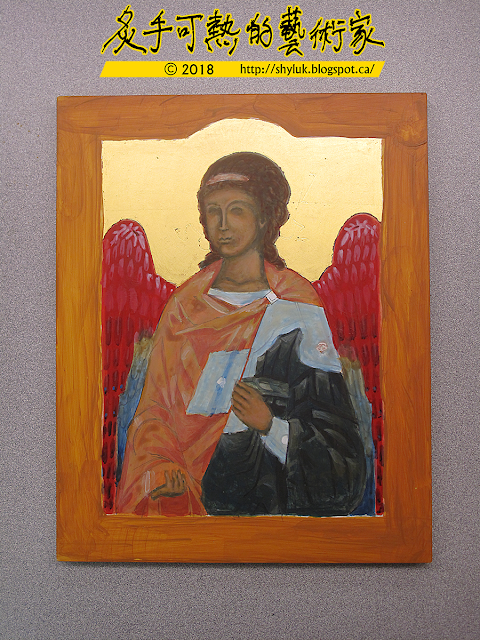
1580 - Archangel VIII


When a bell rings, an angel gets his wings.  "It's A Wonderful Life" (1946) is one of my least favourite motion pictures of all time.  I will grant that it is handsomely produced, it's simply not at all to my taste.

Fortunately for me, I was able to complete the wings on my angel without having to screen that film.  


Monday, December 17, 2018

1579 - Balls On Trees

My wife and I saw this cartoon drawn on a restaurant chalkboard.  I decided to turn it into holiday clip-art.  


Saturday, December 15, 2018

1578 - Archangel VII


Continuing to triptych the light fantastic.  Oh, what a rotten pun.  But this angel is taking shape.  The colours aren't right yet, but the basic shapes seem to be correct.


Thursday, December 13, 2018

1577 - Seven Seconds Of Ungoodness


This is the last Ungood Art Day of 2018, and it can't come too soon.  The thirteenths dfay of every month on JSVB is Ungood Art Day, where I present some of my art that just isn't very good.  

This slice of Ungood Art took me maybe seven seconds to scrawl.  It's a schematic for facial shapes.  It is proof that Ungoodness can be created almost instantly.  


Monday, December 10, 2018

1576 - Guess This Bird

I'm not a bird-watcher.  All throughout my art career, I've always had trouble rendering birds.  If I go slowly and follow a good visual source, I can make a bird on paper.  But most birds are flighty, so I sometimes have to draw quickly.

I found a bird I thought was quite unique, so I drew it as fast as I could and filled in what details I could recall when the bird went away.  Can you guess the bird I drew?


Well, my wife, also a non-birder, takes one look at my sketchbook and announces, "It's a whiskeyjack."  Otherwise known as a grey jay, this bird spans all across North America and has an estimated population of at least 21.5 kajillion.  Somehow, I missed seeing them all except this one.  


Thursday, December 6, 2018

1575 - Big Green Saviour


Here's a religious sketch from my sketchbook.  It's of a larger-than-life statue of Jesus Christ in the evening sun.  Since I used a green pencil, the sunniness doesn't quite come through.  


Saturday, December 1, 2018

1574 - Skyline Car Sketch


The Skyline Car is the most recognizable car on The Canadian, Canadian Pacific Railway's flagship passenger train.  It's a double-decker car with a small lounge on the bottom and seating on the top under a large glassed-in bubble roof.  The views from the Skyline Car are spectacular!


Friday, November 30, 2018

1573 - Bar Car Sketch


The efficient bar car on board The Canadian, Canadian National's flagship passenger train.  The bar is well-stocked, but because it's on a train it's also really small.  From what I know, tall fat people like me would have a hard time staying employed as staff on a train since we're simply too big to be helpful.  

The bar car, though, has the most comfortable seats on the train.  I guess not many people sit there, although the bar is certainly popular and the bartenders are always busy.   


Thursday, November 29, 2018

1572 - Lounge Car Sketch

Late October, my wife and I were thrilled to experience our dream vacation, travel by rail all the way across Canada.  The train is the Canadian National #1, the flagship of the passenger fleet, called "The Canadian".  If you have a Canadian ten dollar bill with picture of a train on the back, that's the one. 
 
The trip was amazing, and the CN staff were very friendly and most helpful at every stage of our journey.  It really was the trip of a lifetime!  Of course we took a lot of pictures, documenting Canada from east to west.  I'll probably post a few of the better ones as time goes by.  
 
However much we loved the train, it wasn't a great venue for visual art.  It's insular: you're cut off from the rest of the world as the train trundles along.  There's not much in the way of electronics or technology, either.   Riding the train is very much like going back in time.  My wife and I really enjoyed it.  But the one thing I didn't count on was that the train jolted around quite a bit as it ran, making fine-lined artwork difficult unless the train was stopped. 
 
I did make a few sketches along the way:
 
 
This is a view of the luxurious Lounge Car, which the is the final car on the train.  It has curved windows all around the back to allow for many interesting views of the scenery.  Comfy padded chairs make the Lounge an excellent place for passengers to congregate.


Wednesday, November 28, 2018

1571 - World Domination #2


Right after I bought it, my World Domination notebook fell into the wrong hands, just as I predicted.  Some master spy (with my wife's handwriting, looks like) sketched in Plan For World Domination #2.  


Monday, November 26, 2018

1570 - World Domination #1


I bought this book, "Plans For World Domination".  It's just a notebook with a fancy cover that I like a lot.  Things have been complicated lately, so I felt I needed a good portable notebook to keep track of events.  

I've decided to throw in a few actual plans for world domination, just in case this book falls into the wrong hands.  I'd like to give spies something to think about!  Below is Plan Number One:


Thursday, November 22, 2018

1569 - Four Studies Of Tarkin


Now I have some studies of Peter Cushing as Grand Moff Tarkin from Star Wars.  Since there are a lot of sources for this, I followed them fairly closely.  I didn't try to be creative.  I did try to be more careful with my line quality.  

Just like Marlon Brando, Peter Cushing also had a life cast made of his face.  It was this life cast that was used to create the computer-generated Tarkin in the Star Wars story Rogue One (2016).  Interestingly, the life cast was originally made for the comedy Top Secret (1984): Peter Cushing was part of an elaborate, surreal joke involving a magnifying glass and an oversized eyeball.  The cast survived in a warehouse and was used to re-create the fearsome Tarkin many years after Peter Cushing had passed away.  

Some of my all-time favourite Star Wars trivia: you only see Grand Moff Tarkin's feet once in Star Wars.  That's because the boots provided for Mr. Cushing were a couple sizes too small.  After enduring the boots for one day's shooting, Mr. Cushing stood firm that he would film the remainder of his scenes in his fuzzy bedroom slippers.  Does that make Tarkin less fearsome, or more so?  

Grand Moff Tarkin is the intellectual property of Disney.  


Tuesday, November 20, 2018

1568 - Archangel VI


I've focused om rendering garments.  Although the colours are different, the folds of the cloth in this angel are as similar as I can make them to those of my previous angel.  The shapes should be mirror images.  


Sunday, November 18, 2018

1567 - Maple Leaf


A colourful study of a maple leaf.  It took little time to make this.  I like the colours, though. 


Friday, November 16, 2018

1566 - Archangel V


Today's progress on my icon acts as a cautionary reminder for every artist always to bring all of your art supplies to work with you!!  I forgot most of my brushes and visual references, so as a result all I could complete was monkey work and the things I could do by memory alone.  

"Monkey work" is just the process of laying down boring, low-skill paint strokes.  It helps to colour inside the lines, though.


Thursday, November 15, 2018

1565 - Three Studies On Jor-El


I've been making studies of Jor-El, Superman's father.  I need to gear up for a big science-fiction project I am wanting to attempt.  I am way out of practice for this kind of drawing, so the only way to get any better is to draw more and more.  

These studies aren't all that bad, though.  I've been using Marlon Brando as an inspiration.  I find Mr. Brando to be one of the most fascinating actors the Hollywood studios have ever produced.  He had a tough life, but a very rich one, and was full of insight.  He also was compulsive about recording himself, so there exist hundreds of hours of tapes that form his autobiography.  Apart from his films, Mr. Brando also had life-casts made of his face and he allowed himself to be laser-scanned by Electronic Arts.  There are quite a number of easy visual references to the man.

Of course I'm not trying to copy them, but Marlon Brando did make a terrific Jor-El and I would like to capture some of that essence for my own project. 

The character of Jor-El is the intellectual property of DC Comics Inc., a subsidiary of Warner Bros. Entertainment.  


Wednesday, November 14, 2018

1564 - Archangel IV


Here's progress on my archangel icon.  Ooh, it's kind of reddish, isn't it?  Maybe this angel is embarrassed that I am taking so long to finish.  Also: the underpainting tends to be dark and rough-looking.


Tuesday, November 13, 2018

1563 - Puck In The Saddle Again


Back in the saddle again!  After a substantial time away from JSVB, I've returned to present yet another Ungood Art piece.  On the thirteenth of every month, I try to post some of my Ungood Art.  These are works that I have created that for whatever reason just did not turn out.  I think it's important to celebrate these failures because we all fail at doing things and from these botched efforts we learn to be better.  That and it can be fun for you to laugh at my mistakes, I get that.

Today's Ungood Art is one of the blandest ever, though.  It's just a hockey puck from my failed and abandoned painted hockey puck project.   I put the puck on my flatbed scanner (see the scanner in action by on JSVB Post #1462 - click here!).  In high resolution, the paint on the puck looks terrible.  It's a good thing it all peeled off.  Who knew you can't paint hockey pucks?


Sunday, October 14, 2018

1562 - To Fifty And Beyond


I turned a sketch of my wife into her birthday party invitation.  The party was extremely nice: great food, lovely company, and the BC Lions even beat the top team in the league. 


Saturday, October 13, 2018

1561 - Brown Pucks Of Near-Infinite Regret


Today is the thirteenth of the month, a day normally reserved for JSVB Ungood Art Day.  Every Ungood Art Day, I present some piece of mine that started off its journey with the best of intentions but somehow fell off the rails.  

The thirteenth of October is also my wife's birthday, something that doesn't intersect well with Ungood Art Day.  Sometimes on this day I'll post birthday stuff, but today I have to report the unceremonious end of my Great Canadian Hockey Puck project.   Tomorrow, I'll post a little on my wife's birthday.

The idea for these pucks was to have them painted with hockey pictures to sell for Christmas.  Nobody seems to paint hockey pucks, so I decided to try the techniques I learned from writing religious icons.  Gesso primer sticks to puck rubber, so I felt I had a good start.

Sanding the gesso to make the surface smooth turned into a disaster, though: the pucks all turned brown.  Nobody will buy a brown puck.  The options were to re-prime the pucks (time consuming) or simply paint them white again (leaves a rough surface).  I decided to paint them white, which worked.  Time was short, though.

To speed things up, I set upon the idea of using heat transfer to set mass-produced images on the pucks, rather than having to detail each image by hand.  Heat, it turns out, causes the gesso to peel off the puck like a decal.   This isn't high heat either, just a friendly puff of warm air from a hair dryer.  

Time has run oout on this project.  I don't like letting it go, but I don't have any positive feeling about it, either.  People will just have to do without hand-painted hockey pucks this Christmas.  Oh well, there's always the Poopsie Slime Surprise Unicorn.


Friday, October 12, 2018

1560 - Vial Artwork


"Wow, that's really, really vial," my wife said medicatively. 


Monday, October 8, 2018

1559 - A Small Bat


Just a small piece of batty clip-art, drawn quickly.  


Sunday, October 7, 2018

1558 - Archangel III


I decided on the colours for the new angel: dark green and rose gold.  The armour will be silver.  I've started painting in the face.  It looks like a mask now: successive layers of thin paint will blend the colours. 


Friday, October 5, 2018

1557 - The Maltese FedEx


Me shipping artwork.  Guess which book this exact quote is from.  If you get it right, award yourself 10,000 Style Points. HINT: it's a trick question.  ALSO: the exchange rate today for Style Points into Real Points is fifty-five hundred million Style Points equals one Real Point. FINALLY: I generally ship with Purolator rather than FedEx. I buy Canadian!  Plus, the courier is usually very good about shipping artwork.

Good luck!  


Thursday, September 27, 2018

1556 - Archangel II


Progress on the archangel: look!  The gilding is solid, mostly.  You can see nicks and loose bits, but those places will be covered in pain and won't be seen.  I've also blocked in some basic colours and filled in the sanquir, which represents the darkest shadow of the skin tone.  I call it The Green Blob. 


Wednesday, September 26, 2018

1555 - Hockey Puck Project I

On the hottest day of summer, the most Canadian thing I have even encountered happened to me.  The neighbour's kid was going door-to-door selling used hockey pucks.  

It was above 40° outside, so the boy was roasting.  I don't know where he managed to get them, but he had his little red wagon filled with hockey pucks, maybe a couple hundred or so.  Quite a few of them looked like game pucks or souvenirs, and some I believe were tournament pucks.  He was selling them on the street to make money to buy ice cream.  I bought a couple of pucks that I thought were nifty. 

Then I saw he had two or three dozen blank pucks.  I doubted anyone would buy those.  A flash of insight led me to purchase all of the blanks: what if I painted artwork on them?  The value added should no doubt fetch a high price.  So, I'm going to paint hockey pucks, and the boy and I can sell them and we will split the profits.  I figure custom-painted hockey pucks will be popular at Christmas!  


Intuition assured me that a regulation hockey puck would fit precisely within a Mason jar lid.  I think I may have even saw this in a dream.  I tested out my theory, and the fit is exact.  I am using the inside rim of the lid to draw the outer edge of the paintable area of each puck.  It's easier than using a compass.


I'm painting the pucks with gesso, since gesso sticks to most surfaces and itself provides primer for acrylic paint.  I'll fill in the circles with white gesso and sand them smooth. 


Tuesday, September 25, 2018

1554 - Bad News Bears: Unfinished Art

Injustice prompted me to draw a political cartoon. 

Illness postponed it past the date where it could have been relevant.  

I suppose I could still finish this work and make my point, but by the time I did that, nobody would care, not even the person against whom the injustice applied.  The artwork is decent, though.  The fact that the people in the artwork are bears I think is funny (and relevant to our neighborhood, where bears keep hunting our garbage cans, swimming in our hot tubs,  and playing with our lawn ornaments).  

It took me a few hours to get the likeness on the big bear correct.  He's a news editor chewing out his cub reporter, so now they are the Bad News Bears.  


Monday, September 24, 2018

1553 - Archangel I


It's icon time again!  And, if you've followed JSVB, you will recognize it's yet another archangel.  I'm not even going to bother naming this one until the end, but this one is Gabriel.  

The only reason this angel is Gabriel is because I wrote (painted) another icon exactly like it but as a mirror image.  The steps I will follow to create this icon I hope will be exactly like the ones I employed to create its mate, Michael (mis-labelled as Gabriel all last year in JSVB). I'll change this icon's robe colour, perhaps. 

As Star Trek proves, Gabriel (Lorca) and Michael (Burnham) are largely interchangeable.  They just use different colour schemes.   

Despite the ragged look of the gold, the gilding went well.  The gold needs to be brushed - carefully and gently! - and sealed.  


Saturday, September 22, 2018

1552 - "Two Worlds"


The finished bespoke globes of the fictional planets Mongo (Flash Gordon) and Krypton (Superman).  It's time for me to pack these up and send them to my clients.

Generally, I'm not sentimental over my own artwork.  A lot of it has been archived digitally so I can revisit it at any time.  However, there's only one Mongo and one Krypton.
 I'm wistful about sending them away.

They are flawed, since they are prototypes. I learned a fair bit about globe-making, though.  And while for a few days I catalogued my errors and self-made promises to do better next time, I ended up simply staring at these worlds and wondering at the adventures a brave pioneer would experience soaring their many-coloured skies, swimming the depths of their cobalt oceans, or setting foot on their alien soils.  

The volcanoes of Kira smoulder.  The forests of Lurvan beckon.  The pull of the Magnetic Mountain is real!  (No, it isn't.  I decided against putting a magnet in Magnetic Mountain.  But it does look like that, so incredibly corny, but that's what I get for using a comic book as an atlas, alas.) 

Strange to me, the feeling that these pieces are not just the result of my artistic intent and skill, but that these planets really do echo the supersonic exploits of those great Golden Age superhero comics.   What great fun it was to manufacture these token worlds!  At night, I look up into the galaxy and gaze in giddy wonderment.  Which blazing stars possess these worlds for real?


Friday, September 21, 2018

1551 - "Muni Tunes"


Earlier this year my friend Greg Moore, Mayor of Port Coquitlam, announced that he was retiring from politics.  Well, there goes one of my best clients.  For the past ten years or so, I produced Mayor Moore's political literature.  In that time, I also developed a cartoon version of Mayor Moore that we used in several social media campaigns.  

A couple of days ago, I presented my final Mayor Moore cartoon artwork.  Back in Spring of this year, I had been approached by Polly Krier, who runs a successful marketing company specializing in corporate events.  Polly suggested that I could come up with some artwork for a  roast for Mayor Moore, and Greg gave Polly his blessing.  

The concept for the artwork came to me in a momentous flash: I'd adapt the famous exit line from Porky Pig to my cartoon Mayor Moore.  I had to double-check that fair use would apply to this work, and made certain that my version had enough changes so that it resembled the Warner Brothers studio work without copying it.  That, and since my project is definitely satirical, "Muni Tunes" satisfies fair use copyright law.  

The roast was phenomenal!  For better than two hours, Mayor Moore endured playful barbs from his friends, family, and co-workers in a gala theatrical celebration of his civic career.  Many of the jests spoke genuinely to our hearts as Mayor Moore has contributed so much to the city of Port Coquitlam both as a municipal leader but also as a profound and generous benefactor to our community.  Even as he leaves us as Mayor, his legacy Greg Moore Family Community Fund will continue to provide money for campaigns to assist the underprivileged in our city: the roast alone raised over $130,000.   My own contribution of artwork is hardly significant compared to what Polly, Greg, his wife Erin, and Foundation Chairman John Diack have achieved.  Yet Greg took to time to make sure that I was recognized and made a part of the event, something which honours me more than I can say.  

The last ride of the Four Horsemen: the Mayors of Port Coquitlam, Coquitlam, Port Moody and Anmore.  Also: hey, look!  My artwork! 


Monday, September 17, 2018

1550 - Varnished Truths


So this is the varnishing process.  Varnish acts like a magnet to airborne debris like dust and hair, so the artwork should be hermetically sealed for as long as possible until the varnish dries.  The result is an hours-long meditation on what it takes to eat twelve kilograms of cherries.  I doubt that I have eaten a single kilogram of cherries in my lifetime, I don't like them very much.  The pail came from a restaurant dumpster, I think, or was given to me empty.  Right now beneath the upended pail are the globes with still-wet varnish.  The varnish will seal the artwork for posterity and freshen the colours.  Since I am using glossy varnish, it will also balance the parts where the labels were too shiny.

Liquitex again.  The reason I am gravitating to Liquitex is that the local art store runs out of Golden and the other product lines.  I really should get up earlier in the morning before all that is left on the shelves is Liquitex.

The Liquitex varnish is okay.  As a big plus, it doesn't need to be mixed or thinned.  Having to do mixing means there's a chance of introducing air bubbles into the varnish which can be nearly impossible to dissolve.  This varnish also goes on in thin layers.  For flat artwork, you'd want a thick varnish so that you only need to apply it once and it dries flat and smooth.  Thin varnish shows brush strokes, but on the other hand it dries much faster and it won't run along non-flat surfaces (globes consist entirely of non-flat surfaces).  So, thin varnish needs multiple applications.  Liquitex gets cloudy the more layers you add, so there's an upper limit as to how much varnish I can use.  After I lift the cherry bucket in a few hours, we'll know how the final result looks!  


Sunday, September 16, 2018

1549 - Bespoke Worlds: Krypton IV


Krypton, labelled.  Just as with Mongo, applying the labels was a huge pain in the rear end.  At least I learned my lesson about using dark pigments. 

The Dandahu Ocean was crossed by Superman's long-lost ancestor Val-El who voyaged from the ancient city of Erkol to discover the new world continent of Lurvan via the Red Ocean.  Along the way, Val-El encountered Vathlo, the island of highly-advanced black citizens of Krypton. 

The final step is to varnish the globe, which will make the whole world glossy and vivid, and also balance out the not-so-shiny areas.


Saturday, September 15, 2018

1548 - Happy Baby Sketch


A quick ink design for a happy baby.  The forehead was large enough to hold the JSVB watermark. 


Friday, September 14, 2018

1547 - Two Stethoscopes


A sketch of two stethoscopes.  I haven't drawn anything for a very long time, so I feel I am rusty.


Thursday, September 13, 2018

1546 - Heedlessly Redacted

The thirteenth day of every month on JSVB is dedicated to Ungood Art.  It's where I post stuff that I have created where I had the intention to do something well, but instead it turns out not so well, or as the opposite of good: ungood.  


This is the label sheet for the place names for both Mongo and Krypton, the custom-made globes I am building.  Each cut was supposed to be laser-precise: two vertical strokes and two horizontal strokes to contain each label in its own perfect rectangle.  Instead, it looks as if I've redacted Fred Flintstone's poem to Wilma:

I love thee Wilma, with hair like silk,
Lips like cherries, skin like milk,
Your shell-like ears, your dainty hands,
And eyes so black, like ▓

I guess I need better technique with the knife.

*PS: the redacted words are frying pans.  


Wednesday, September 12, 2018

1545 - Continental Context


So this is basically just a text file, but it took a long time to produce so I decided to use it as an entry for JSVB.  These are all of the labels for the fictional geographic names on the globes I made for both the planets Mongo (top) and Krypton (bottom).  

The names were culled from various stories and hand-drawn onto maps for comic books.  A few of the names are simply exotic and alien.  Some of the names are similar to names of places on Earth, but with different spellings.  After these come quite a number of names that are simply descriptive of the location they are attached to, like Fiery Desert and Glass Forest.  Either the writers grew tired of alien-like names, or else they wanted to keep things basic for easy comprehension.  

I began wondering how Earth landmarks would be named, if comic book writers were in charge of things (like they are now, at least in films and on television).  Mount Everest would be Giant Mountain.  The Mississippi could be Meander River.  The populated east coast of the United States has already been likened to Metropolis or Megacity One.  The Russian steppes?  Fro-Zen Plains.  The South American jungle?  Ver'Dant Forest.  Australia equals Island Land - I like that one.   


Monday, September 3, 2018

1544 - Bespoke Worlds: Krypton III


Since the Planet Krypton explodes in the very first panel of the first Superman comic, Superman himself remains ignorant of his own heritage.  As Superman comics mature, they do add some backstory for The Man Of Steel.  Literal bits and pieces of Superman's home planet reach Earth, providing plot developments and exotic Kryptonian characters, some who are villains and some who remain allies.  

In September of 1981, DC Comics published The Krypton Chronicles, which was an attempt to codify history of life on Krypton from the point of view of Superman and his ancestors.  From a very practical standpoint, The Krypton Chronicles represented a change in DC's comic book format, adding a single sheet of paper into the comics, which when folded allowed for two more pages of artwork and two more pages of advertising as well as the excuse to bump up the retail price of the book by 20%.  Since a page of artwork takes around a day to produce, the deadlines for the comic books became that much tighter.  At least in the Krypton Chronicles, the art for the two new pages was as cheap as anything I've ever seen, and must have been rushed at top speed to completion. 

Still, what readers got was interesting lore, even if it was somewhat unformed: brief glossary terms for the Kryptonian language and a sketch map of the planet drawn by Albert de Guzman.  This map seems to have been the basis for other maps and comics that followed.

The Krypton Chronicles are available to read online, which helped me greatly in my research for this globe.  The story is a batty mix of science, history, mysticism, and prophecy that seem to borrow heavily from Christian Bible stories and Robert Louis Stevenson.  The de Guzman map shows all of the places mentioned in the Chronicles.  However, the map itself is drawn very simply onto two circles to represent the planetary hemispheres.  As a result of this haphazard projection, much is made later on of the split between Krypton's Old World and New World hemispheres.  

The progress of the El family, (Jor-El, Kal-El, Val-El, etc.) charts the progress of Superman's ancestors as they discovered new scientific and theological advances in the Old World. They migrated to the New World to populate an unexplored continent after a catastrophe appears to destroy the old one.  Since the El family are among the most honorable of the Kryptonians, several splinter colonies are created by dissidents who do not agree with the Els, including The Island Of Thieves which split from the main expedition.  Those who reject Kryptonian  orthodoxy tend to remain on the Old World hemisphere while the right-thinkers congregate on the New World hemisphere as close to Kryptonopolis as possible.  Renegades who no longer serve the plotline are doomed to explore the Valley of Juru, where no-one who visits it escapes with their lives.  

Creating a globe eliminates the hemispheric divide of the de Guzman map.  Correcting the faults in the map projection shows that the Old World and New World continents are not far apart, and that Val-El's eastward journey across the Dandahu Ocean would have been much shorter had he not detoured to see Vathlo, the island sanctuary of Krypton's highly-advanced black people, and then subesquently sailed into a vortex storm.  

As far as my artwork is concerned, I've coloured in the oceans and the continents.  In the picture above, you can see the Red Ocean.  To the east are the large mountain ranges: The Jewel Mountains, the Gold Volcano, and the strikingly obvious Magnetic Mountain.  I was tempted to put a real magnet in there.   


Saturday, September 1, 2018

1543 - Bespoke Worlds: Krypton II


The Planet Krypton I think has more water than the Planet Mongo.  It's a wetter world.  Practically speaking, Krypton is very much wetter.  Since I've taken care to put extra gesso on this globe, it also takes longer to dry and for it to be workable.  

Learning from the lessons of Mongo, I've decided to make Krypton's colour palette considerably lighter.  This will make for a more cartoony-loking world, which will please my client.  However the lighter pigments I use cover the white gesso poorly, so I have to use more coats of paint, and you guessed it: drying time is thus multiplied.  Lots of opportunity to snap pictures of my progress while I wait for the next layer of paint to dry - this is what you see in today's JSVB post.

Why is there red paint in my palette while the water is all blue?  Because Krypton has a Red Ocean.  Krypton and Mongo both have features that are a lot like Earth, but are somehow dialled up a bit to make them more exotic or romantic.  We have a Red Sea, the Kryptonians had a Red Ocean.  The Red Ocean is on the New World Continent Lurvan, on the far side of the planet, whereas we are looking at the Old World Continent, Urrika. The water in Urrika is The Boiling Ocean, which as far as I know is the only inland body of water on either Krypton or Mongo.  Not many lakeshore condos on either world.