Saturday, March 31, 2012

565 - Minerbot II


I'm not averse to going back and taking another look at a previous project.  In this case, I've made minor revisions to my Minerbot pic from two days ago.  I added some more metallic pieces and reflections to make the character's chin stand out better.  I also added more asteroids for the Minerbot to mine. 

Check out the previous Minerbot by clicking here.


Friday, March 30, 2012

564 - 'Frisco B & A

"B & A" is my slang for "Before And After". 

Source photograph courtesy of my friend Earl. 

My friend Earl dug up a photograph from the 1990's of San Francisco.  It's grainy, scratched, and lacks composition on account of Earl not bringing along a decent long lens for his camera.  Earl did not think this picture could be enhanced with Photoshop, so I took that as a challenge to try:

Alcatraz and San Francisco - the "After" pic.
I did what I could.  Perhaps Earl is partially correct that the image was a wash, but I feel that I was able to pick a few things up.

Early in the workflow, I decided that the aspect of the picture should be panoramic wide.  The source picture was both grainy and low-resolution, which meant that enlarging anything would result in big formless blobs.  So, a simple crop wouldn't do.  I decided to boost the resolution to 300 pixels per inch, and enlarge Alcatraz Island as well as move it to the right.  That way, I could also enlarge the city and make a decent crop. 

The city proved to be very obstinate, on account of many distracting artefacts caused by enlargement.  I decided to create a mask for the city which allowed me to keep its silhouette.  Inside this mask, I wiped out all of the grain and noise artefacts, leaving San Francisco looking flat.  I did the same thing for Alcatraz.  The result looks cartoony, but I was able to preserve the smoky colours I liked so much. 

I added some depth using colour and hand-painted lights to Nob Hill and the financial district.  After wrestling with the idea, I also decided to add lights to Alcatraz, despite the infamous prison having been decommissioned decades ago.  The lights make the island look less two-dimensional. 

Then, I needed to add the bridge.  It's been a very long time since I've been to San Francisco, so I only dimly recalled that the iconic Golden Gate should be to the right of Alcatraz from this view.  So then what is the bridge in the background left?  I looked it up on Google™ Maps.  I had to find a vantage from where Earl must have got Alcatraz, the city, and a bridge all in one shot.  I settled upon the vantage at Horseshoe Bay, which made logical sense.  Horseshoe Bay is the future site of the intergalactic headquarters for Star Trek's Federation Of Planets.  Earl, being a huge Trek fan, would gravitate there the way Martok gravitates to a 2309-vintage bloodwine (hint: the attraction is strong!).  A scan of the Google™ Street View showed a spot that must have been close to where Earl took his photograph.  I deduced that the bridge in Earl's shot was the Bay Bridge.  Fortunately, its simple silhouette was very easy to draw by hand. 

I used a lot of Gaussian Blur to make the scene fog-bound.  Gaussian proved to be a good choice, as it blurs much the same way that true fog blurs our vision in nature.  The blur also helped to remove the scratches that Earl's photo had endured over time.  Ironically, I used a noise filter to bring back some speckles to match the grain of the film that I chose not to blur out. 

Finally, I cropped the image to an aspect that I think looks good, and played with the image curves.  The curves belong to the colour graph of the image.  By adjusting the curves, I can create new colour components.  In this case, I brightened the image a little, which caused a pleasing glow to emerge from around the building skyline. 

I think this picture looks a lot better in high resolution, but Blogger does not easily show landscape-style aspects in anything better than screen resolution, which is low.  I was also tempted to bring this picture into my Painter program, but the challenge was to use only Photoshop.  Maybe I will tackle this image in Painter another day.


Thursday, March 29, 2012

563 - Minerbot


This is a "Minerbot" character I created for my custom-made art roster intended for the runaway hit indie videogame "Space Pirates And Zombies".  The Minerbot is a robot that tends to the space mines.  Ironically, he is one of the most minor characters in the whole game.  In fact, in the base game when the player contacts the space mining company, all he or she will see is a very bland space mining company logo.  Seeing as I like doing character work, I created an all-new robot who will answer the phone.  Hopefully, the Minerbot will add some visual flair to a small corner of the game. 

Here is the roster of characters I have updated in the game:

 
The characters for Space Pirates And Zombies appear on JSVB with the kind permission of their owner, Minmax Studio.  


Wednesday, March 28, 2012

562 - Weather Trend

March 2012 came in like a lion, out like a lamb, and then trended with wild abandon towards Al Gore.  Thanks, global climate change! 


Monday, March 26, 2012

561 - Ins & Outs Of Lions & Lambs


As I have mentioned before on JSVB, to be Canadian is to be able to talk about the weather.  A staple of the Canadian farmers' almanac is to claim that if March comes in like a lion, it will go out like a lamb.  Or vice versa.  The intent is that March will have some really stormy Winter weather and then some very pleasant days in Spring. 

This March seems to be even more mixed-up than usual.  Plenty of lion, lots of lamb, very little logical progression from one to the other.  A couple of days ago we had snow, calm, sun, rain, hail, wind, sun again, and snow again.  It's exactly the sort of day I would call up if I had my hand on the weather control dial.  Folks going out of the house would have to wear sunscreen, parkas, galoshes, and swimsuits. 


Saturday, March 24, 2012

560 - "Back Of The Bus"


Last week the Alberta Wildrose Party, a conservative provincial political party in Canada, unveiled their new campaign bus.  Typically, a campaign bus features a colourful full-body graphic wrap that is eye-catching and emblematic of the political party.  Wildrose succeeded on both counts.

For reasons only the Wildrose campaign staff comprehend, they decided to place the portrait of their attractive leader, Danielle Smith, directly above the double wheel well at the back of the bus.  The wheels appear exactly where Ms. Smith's breasts should go, perhaps as an indication of the Wildrose ethic: doubly driven to get the voters' attention. 

I wish my little political cartoon was an exaggeration, but I simply cannot make this stuff up.  I based my image on a photograph taken by John Archer of the Canadian Broadcasting Corporation.  You can search for it on the Internet and find it easily. 

I used to live in Alberta, but not anymore.  The Conservatives at every level of government in that province seem fond of creating grandiose projects without the benefit of completely thinking them through.  Danielle's bus is the most entertaining gaffe since the formation of the perfectly irony-oblivious Conservative-Reform Alliance Party (CRAP).  In Alberta politics there is truth, but only through negligence. 


Friday, March 23, 2012

559 - The Opposite Of Excitement


Well, I've got this thing, which I have posted.  It developed into nothing useful, except that I can click off another JSVB post. 


Monday, March 19, 2012

558 - "Space Skid Puff"


Perhaps the second-most fearsome Space Pirate in the Space Pirates And Zombies universe is Space Skid Puff.  Although he pilots a powerful space cruiser bristling with weapons, Space Skid Puff ends up second-best in any contest with Captain Don and the valiant crew of the Clockwork. 

My painting of Space Skid Puff does not stray far from the original model.  He is the only character in the award-winning space-combat videogame "Space Pirates And Zombies" who has a character icon as well as a specialist icon.  Specialists are characters who can come to work on board the Clockwork, the hero pirate ship in the game.  The player normally rescues specialists from being marooned in deep space.  Space Skid Puff is unusual in that he is the only specialist that has dialogue in the main game.  So, his dialogue icon needs to be a close match to his specialist icon.

I've added a dramatic chiaraoscuro effect, which is a technique of using bright highlights and dark shadows.  In the hands of a master, chiaroscuro (Italian for "light-dark") is powerful and engaging.  My version makes Space Skid Puff look like he was painted on black velvet.  I'm sure the real Space Skid Puff would not mind. 

Space Skid Puff is the intellectual property of MinMax Studio.  With their kind permission, he appears on JSVB along with the other Space Pirates And Zombies characters I have rendered (please click on the names to see them):

Thursday, March 15, 2012

557 - Putto'n On The Ritz


Cherubs, or in the classical Hebrew plural cherubim, or the modern English pluralization of cherubims, all come to represent the same thing: high-order angels.  Cherubim are less powerful only compared to the mighty seraphim, who are beings of such pure holy majesty that they exist only as radiant energy.  Their sense of charity is so strong that they emit powerful rays of burning love.  Typically in Orthodox iconography, seraphim are portrayed as heavenly disembodied heads surrounded usually by six powerful wings.  Since the idea of iconography is to portray the idea of a religious being as opposed to documenting its exact features, a six-winged disembodied head is as good as anything to describe seraphim.  A direct encounter with a seraph would likely de-molecularize a mere human. 

So if cherubim are only slightly less powerful angels than the seraphim, how come they look like cute, chubby babies with wings?  The answer lies in a semiotic drift that occurred during the Italian Renaissance.  Properly, the winged babies are called putti (singular putto, meaning "little man").  The putti originate from ancient Rome, where they were associated with the gods at play.  The putti eventually crept into Christian artwork, especially through the influences of the Great Master Donatello, roughly in the early to mid 1400's.  There, the winged putti took their place alongside the powerful cherubim, and eventually the former supplanted the latter in popular culture. 

Scholars are careful to point out that cherubim are sacred and putti are profane.  That hasn't stopped the Vatican from collecting at least a million of the little guys and adorning almost every square inch of the Holy City with them. 

For one thing, putti are fairly easy to draw, and for another, they can fill up a lot of space with images that are dynamic and pleasing.  A painting Master would draw one or two examples, and then have his pupils fill the blank parts of a canvas or a fresco with their copies of the putti.  They provide good student practise for coming up with poses and figuring out how to lay down skin tones using pigment.  If an acolyte showed aptitude rendering putti, he could be moved on to more advanced models. 

Although not very classical, I drew up these two poses as colour models for yesterday's cherub-tastic wedding card, which can be seen by clicking here.  These models helped me visualize the renders I needed to lay out.  


Wednesday, March 14, 2012

556 - RSVP, In Colour


Send me a wedding invitation, and I will send you back a hand-painted work of art.  This is especially true if you go to the trouble of picking out card stock that happens to be decent quality watercolour paper. 

My wife suggested I fill some of the blank space with a few cherubs, so I did.  I am hoping this stunt gets us seated next to the serving table with the perogies and Ukrainian sausage.

The details are small, as the card shown here on JSVB is actual size.


Tuesday, March 13, 2012

555 - "Day Of The Iguana"


JSVB Post #555 happens to fall on the thirteenth of the month, and every thirteenth of the month is by tradition Ungood Art Day. 

Lately, my Ungood Art has been a showcase of how I've been staying within my artistic comfort zone.  That's probably disappointing to those who want the bombastic sequel to the "Bad News Bear" or "Grey Venus Rising"  (click here and/or here if you feel you have to see either piece).  By colouring mostly within the lines, I've been creating pieces I feel are predictable yet competent.  Or worse, I've just been complacent. 

This photograph represents the entire body of sketchwork I did on vacation to Mexico, with the exception of "Cien Pesos, Por Favor", which was last month's Ungood Art (click here to see it), where I as a tourist I sat on the beach and painted rocks for Mexicans. 

Still on the same beach, I sketched the form of an iguana we had seen the other day.  The beast was easily as big as my leg.  It turns out that giant iguanas are common to Puerto Vallarta. 

"Night Of The Iguana" (1964) was a famous motion picture filmed in the region, starring Richard Burton and Eva Gardner.  The wealthy "Gringo Gulch" of Puerto Vallarta likely owes its popularity to the fabulous twin mansions that were purpose-built for the star and his mistress Elizabeth Taylor as lodging during filming.  Later, other mansions and villas cropped up to surround those of the Hollywood lovebirds, and the wealthy tourist trade for Puerto Vallarta was born, or at least so the story goes. 

I digress.  For the sake of completion, here is the final sketch photographed some time before it was swallowed by the ocean tide:


Monday, March 12, 2012

554 - Mac Is Back!


Look out, ol' Mac is back in town!  Mac is the lovable redneck space cowboy engineer from the smash hit space shooter videogame "Space Pirates And Zombies".  Although he has a minor character in the game storyline, Mac proves to be perhaps the most loyal of all the Space Pirates.  Certainly, he does not let his lack of ed-ja-macation get in the way of his willingness to help his friends. 

The original concept for Mac, courtesy of Minmax Studio, was to have him be a lowly construction worker.  I decided in my version to make Mac more of a redneck bumpkin.  He does not look all that high-tech, but I figure rednecks in space will try to stay close to their roots.  Note the Con-Am 69 logo badge I created a few days ago.  The pork tattoo was inspired by a search of rednecks on the Internet.  I adapted the design from a place called "Jimmy's Butcher Shop". 

Check out more Space Pirates and Zombies characters by clicking on their names:


All Space Pirates And Zombies characters are the intellectual property of Minmax Studio, and are used on JSVB with their kind permission.


Saturday, March 10, 2012

553 - Spinnaker, First Take


Yesterday's JSVP post featured some artwork based on a photo I took at the Vancouver Aquarium.  I decided I may as well post the original photo, and you can compare the artwork and the snapshot. 

I recall the Vancouver Aquarium using a similar composition for one of their promotional posters.  Instead of my wife, they placed a toddler up against the glass with the dolphin posed in his majestic greeting stance.  The kid was well-lit and likely Photoshopped.   It would be a very difficult shot to set up without a lot of equipment, as the lighting in the viewing area seldom lends itself to decent photography.   You also see a similar pose in Steven Spielberg's alien adventure epic "Taken" (2002), which was filmed with actress Dakota Fanning posing in the aquarium with three digitally animated dolphins.  With as much of a setup as any of these shots enjoy, it's still a powerful scene to behold.  Even more so when it happens spontaneously as it did with my wife in my photo.  I was lucky to have my camera ready at the time. 

Painting out the image corrects a number of flaws, though.  I took the shot under very low light, so it ended up pixellated, especially in the murky blues.  The focus is just a bit too fuzzy.  The strong verticals are bent because of lens curvature.  And I felt I needed to clean up the dirt at the bottom of the shot and remove the other dolphin poking his or her nose into the frame at the far right.  Full disclosure: I am not even certain this was Spinnaker the dolphin at the front of the shot.   I hope it is! 

With the painting, I corrected these faults and created stronger fin poses for the dolphin.  I was also able to add a few highlights to add more colour and dynamic range to the composition.

You can see the painting on JSVB Post #553 by clicking here.


Friday, March 9, 2012

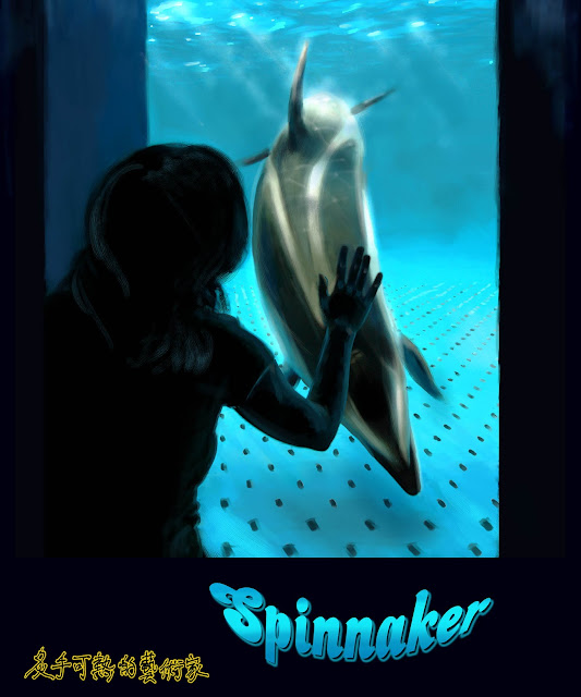
552 - "Spinnaker"


With regret, I report the death of Spinnaker the dolphin who passed away at the Vancouver Aquarium last night.  He was twenty-six years old. 

Today's image represents a fair amount of frenzied digital painting.  It's a near-duplicate of a photograph I took of my wife and the dolphin while at the Aquarium.  The window is in an executive suite that looks into the dolphin pool.  The dolphins know the difference between tourists and the truly interesting people.  They will come up to this window and if they see somebody they like, they strike the haunting, eloquent pose that I depict in my artwork.  It's the dolphin version of a human placing her hand on the glass, feeling the evolution that separates us.  This is a powerful and moving moment to witness, and I feel privileged to have had my camera on hand.  However, the light in the room is very low, the focus is hard to achieve, and the dolphin is tricky.  I decided that I could best overcome the faults in the shot by painting the image for JSVB.   

Here's to you, Spin, long may your big jib draw.


Thursday, March 8, 2012

551 - "Con-Am 69"


A science fictional retro-futuristic company logo patch for Con-Am 69. This is based loosely on the "Con-Am 27" company logo patch from the retro-futuristic science fiction film "Outland" (1981).

I added the iconic Mudflap Girl/Rachel because I thought that would make the logo more amusing, on account of it all being somewhat sexist.  Attributing intellectual ownership of the Mudflap Girl has proven to be a chore.  Some sources claim that Bill Zinda created or at least commissioned her in his truck repair shop in the 1970's.  The United States trademark for "Rachel" is owned by Ed Allen, who says he is the son of the model for the design.  Either way, I freely appropriated the version by Andrzej K. a.k.a. "Szczepan1990" under the Creative Commons Attribution/Share-Alike License.  Mr. Andrzej does not endorse in any way my version of the artwork.  Like him, I provide this artwork as a free reference under my own CC license, as mentioned in the ever-present "JSVB Legal" column to the  right. 


Wednesday, March 7, 2012

550 - Baked Bug


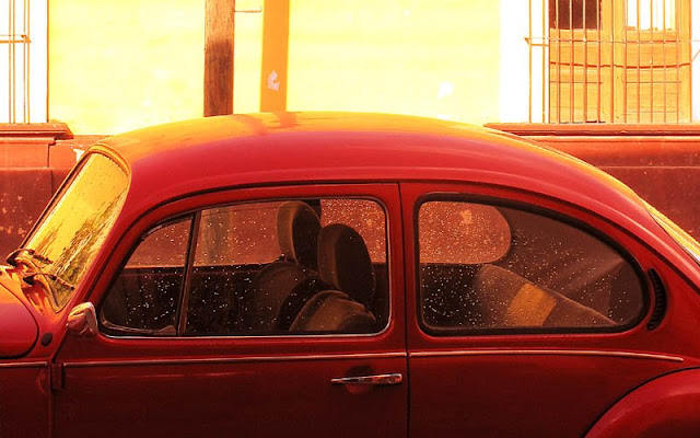
This is an old Volkswagen Beetle, or at least the roof and cockpit of one.  The picture doesn't have the composition I would have liked, but I did have fun playing with the colour values. 

I tried to adjust the picture to make the colours of the Beetle seem more rich, as lifelike as I could I remember them to be.  I did not bother to break the picture down into channels, and work at it section by section.  Instead, I just applied new colour curves to the whole thing at once and cropped out the stuff that looked to have drifted far off the reservation.  That's lazy work. 

Even so, I think I found a true red for the car, and I kind of like the way the rest of the image looks parched as a result. 


Now, I've re-cropped the image so that the car is the focal point of the image.  There's more detail.  You can see it was raining just a few minutes ago. 


Monday, March 5, 2012

549 - Sick Call

Wrapped in a blanket all the time, I am too sick today to make it very far out of bed.  I can sketch a little.


Saturday, March 3, 2012

548 - UTA Flag


For anybody who needs it (...anybody??), here is my design for the UTA flag.  In the highly-rated space shooter videogame "Space Pirates And Zombies", the UTA represent bombastic galactic authority.  I made this flag intentionally gaudy and even a little off-center to satisfy their need.  It's based on the Flag of The Netherlands turned sideways and hue shifted by about ninety degrees.  I scrubbed it a bit in Photoshop and added the text, which is also fairly ugly. 

This flag has absolutely no connection to the Utah Transit Authority, the United Talent Agency, or the University of Texas - Arlington.  UTA is the intellectual property of MinMax Studio, and is used with their kind permission.  Also thanks to Graafix for the use of their flag as my source material. 


Thursday, March 1, 2012

547 - O Admiral, My Admiral!


Here's my take on Admiral Jamison, an important secondary character in the award-winning smash hit videogame "Space Pirates And Zombies", by MinMax Studio. 

Jamison is in charge of the UTA Starfleet, which generally seems to represent law and order in the Space Pirates' galaxy.  Jamison is a decorated war hero, after losing his eye in the Lockdown Wars under similar circumstances to his nineteenth-century counterpart Horatio Nelson.  However, as much as Jamison desires to be a force for justice in human-occupied space, he is also responsible for keeping one of Mankind's darkest secrets under wraps.  It's the kind of secret that an intrepid, semi-responsible band of ne'er-do-well Space Pirates would dearly love to uncover! 

I have a link to major "Space Pirates And Zombies" characters Dr. Carl Memford here, Elsa here, and Captain Don here.

My sincere thanks go to MinMax Studio for their gracious permission to rework their characters.