Saturday, November 20, 2010

259 - Developing The Big Cat


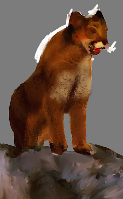
Slow progress on the big cat.  I've laid down the foundation and some fur for the head.  It seemed to go well, so maybe I had better not overwork it.  I've read that most healthy big cats are seldom wider at the shoulders than the width of their whiskers.  Based on that, I may have made the head too large.  If so, I can fix it easily in Photoshop.

Also, I am setting up the background layers.  I sampled most of the colours I wanted at the very beginning of the project: this creates the palette for the piece.  Here, I've re-introduced the palette in new background layers to see if the cat colours look okay. 


Friday, November 19, 2010

258 - Brown & Yellow Baby Clothes

The fine art business is really hard!  You need a lot of talent, perseverance, and great social contacts.  If nobody is buying your stuff, you spend a lot of time, er, not selling much art.

So in an effort to make a lot more money, I thought I'd put out my sure-fire million-dollar idea. 

And here it is:


I designed a concept for brown and yellow baby clothes.  The idea is that if your baby makes a mess, brown and yellow baby clothes will camouflage the worst of it.  Clever stripes, blots, and optical patches deflect visual attention away from the areas that typically get soiled.  The striking brown and yellow tones are completely gender neutral, making these clothes ideal for boys, girls, whatever. 

Of course, these adorable brown and yellow baby clothes still need regular cleaning, but the carefully-deployed anti-spatter patterns will at least keep your tyke looking au courant, even with a bib-load of boiled currant slopped down the front. 

To create this image, I rotoscoped a baby picture I pulled off of the Internet.  The image was public domain from a US Government website.  Hooray for public domain!  Then, I painted over it and threw on the distinctive brown and yellow baby clothes.


Thursday, November 18, 2010

257 - Cat Sketch Fever


Here is a sampling of sketchbook efforts concerning large cats.  Apart from physical scale, and how that large cats tend to keep thair tails low to the ground, large cats and small cats seem to hit many similar poses.  I should really get to looking at the Disney cats.  Athough Walt Disney definitely preferred dogs over cats, his studio designed cat character prototypes that I feel will easily stand up to any for the forseeable future. 


Wednesday, November 17, 2010

256 - Jewel The Size Of My Thumb

Today's JSVB entry features a rather large picture of a rather large spider I found yesterday.  It's not a bad picture, but if you don't like spiders, please do not scroll down to see the picture. 


Smile for the camera!  I found this spider hanging by our front door.  Her remarkable abdomen is about the size of the tip of my thumb.  The flash from my camera makes her look very dramatic.

Armed with this picture, I researched on the Internet and found out what type of spider this is, likely a Jewel Spider.  Judging by her size, she's a female.  In Canada, the species lives in British Columbia and Alberta.  They like to live on houses as they are attracted to lights.  The Jewel Spider is an "orb" spider.  Orb spiders  tend to spin the very regular, round, stereotypical web like you would see from "Charlotte's Web". 

Jewel spiders are common, but shy.  The females attract notice since they get so big before they lay their eggs.  Although they love eating flies, they probably would not bite a person.  Even if you are bit by a Jewel Spider, you would likely only be mildy irritated.  Despite their exotic appearance, the Jewel Spider is not considered poisonous. 


Monday, November 15, 2010

255 - Furrier


Here's some progress on the big cat painting.  I'm working out how to lay on the fur.  I've settled on a method of repeated underpaintings, followed by dabbing on the hairs stroke by stroke.  I have the midrange of my palette working, but I still have to add the high and low tones to make the cat look better. 

I've discovered that there is a timing to laying down the strokes.  Too fast and the strokes blur and lose pigment,  too slow and the strokes come out looking mannered and artifical.  Plus, I am growing old painting fur.  If I follow swing time (think of a quickstep like the jazz standard "Happy Feet"), then the strokes seem to come out right.  I've been listening to a lot of swing recently...


Sunday, November 14, 2010

254 - Salmon Run


My wife and I went out to look at the running of the salmon. Our region in local native dialect is called Kwayhquitlam, which translated into English means "River That Reeks Of Fish Slime". That's not a fact that often finds its way into our tourist brochures. Every year at this time, the salmon come up our creeks to spawn, after which they die. It's a beautiful and awe-inspiring sight, but also a powerful and awe-inspiring stench.

This photo ends up looking very impressionistic. The light was very low on account of clouds being overcast, so I could only use long exposures. The rythmic motion of the fish and flow of water creates an almost painterly look to this image.

For another look at Hyde Creek, please click here to see my painting of a different section of this parkland. Note that it might take four to eight years for the fish in the painting to grow to maturity. Then they will return to Hyde Creek just like the fish seen above.


Saturday, November 13, 2010

253 - True Grit


The thirteenth of every month is Ungood Art Day on JSVB. This time around, the actual art is okay, it's the artist that is ungood. I was making a recipe with corn grits and I spilled a bunch on the stove but neglected to mop them up. Knowing that I would catch disfavour from my wife if I didn't get rid of the slopped food, but not having enough strength of will to hunt down any cleaning supplies, I took the path of least resistance and made a cute mousie out of the messie.


Friday, November 12, 2010

252 - Scanned Ham


I am juggling multiple art projects at one time, which is not my favourite way of handling things.  I get distracted too easily, and pay too little attention to each project.  So in lieu of something wild and exotic, I present a little hamster which I scanned from my sketchbook today.  


Thursday, November 11, 2010

251 - Why We Remember


November 11 is known as Remembrance Day in Canada.  It is a time that we recall the price our soldiers pay as they go to war in our name. 

In recent times, people seem very emotional about how Remembrance Day is observed.  Canada has been at war with Afghanistan since 2001.  While our military involvement is seen as essential, it is not a happy or glorious duty.  We must recognize the sacrifice our armed forces make deploying to the war zone overseas.  Yet, I believe it is this recognition that turns away from the traditional remembrance of November 11.  We are turning this day into something new because we need to. 

Top left is the current standard plastic poppy, the approved symbol of Canadian remembrance for November 11.  It is based on the red corn poppies that grow as weeds in the battlegrounds of World War I.  The poppy was featured in the famous poem "In Flanders Fields", which pleads for us to remember the brave sacrifice of  soldiers who died for us.

Top right is a poppy with a yellow ribbon.  The yellow ribbon is a symbol of support and recognition of our troops.  However we feel about the war in Afghanistan, we cannot ignore the efforts and contributions our troops are making overseas. We cannot allow ourselves to diminish their place in society. 

Bottom left is a white poppy.   This is a relatively new symbol that calls for peace instead of war.  It is not a figure of remembrance, but rather a clarion for change.  The white poppy sometimes comes with text as seen in the illustration.

Bottom right is the traditional poppy with a green center instead of a black one.  Originally, Remembrance poppies had a black center, but were changed to green to "represent the fields of France".  Later, the poppy regained its black center, but not until after such period of time as the green material in stockpile had been used up. 

We are free to celebrate Remembrance Day as we see fit thanks to the bravery of our veterans.  We can observe a moment of silence, we can take the day off to go shopping in the US, we can attend the military service at the cenotaph.  What we cannot do is diminish the contribution our veterans have made to keep Canada free.  We must not take away crucial benefits that keep our soldiers from becoming destitute in our time of great wealth.  As one vet said at today's cenotaph ceremony, "We are not looking for any more.  We are just looking to not lose what we have". 


Wednesday, November 10, 2010

250 - QRiouser And QRiouser...

Curiouser and curiouser...


Check out this little black and white box, it's part of the Brave New World.  It's called a "QR" Code.  It's an improved version of a bar code.  Very basically, it's what you get if you took two bar codes and overlapped them, with one turned perpendicular to the other.  Each black or white box forms a pixel in a grid, and the entire grid is a matrix.  Data stored in matrix form tends to take up less space than in linear binary form (i.e. a bar code), while at the same time, a matrix can hold more data. 

For example, a bar code can hold up to 20 numbers, wheras a QR Code can hold up to 7,089.  A QR Code cans also store text or pictographic information, like Japanese kanji writing.  At the same time, a QR code can be up to ten times smaller than a bar code and still be legible.  The one I have posted above is greatly enlarged for artistic merit. 

A QR Code can be read by any device with a camera and QR software.  Smart phones generally come with QR apps built in, or with the ability to use a freeware QR app.  Simply scan the QR box with your smartphone, and you will see the data right away.  In this case, my QR Code links here to my blog, JSVB. 

QR Codes can be read from computer screens or printed out.  The boxes in the corners provide alignment cues so that even if you take the picture crooked, the data will still be read correctly. 

"QR" stand for "Quick Response", and was originally designed by the Denso Wave Corporation of Japan in 1994 as a means to track packages and industrial parts.  Although Denso owns the patent rights to the QR Code, the code is free for public use.  The actual name "QR Code" is a trademark of Denso Wave. 

I created this code using free online software.  Many thanks to Allan who double-confirmed that my JSVB QR Code actually links properly to JSVB and not some crazy porn site. 


Tuesday, November 9, 2010

249 - The Fur Flies

Moving on the big cat picture, I am reminded of all the crazy bugs that plague my work flow when I am working with large files.  I spend more time with file management than I do painting. 

I am teaching myself to paint proper fur, which is something I've never worked on in detail before.  Ordinarily, I watch my line count.  This is where I go into a drawing and count all the lines.  It's a routine I've picked up from animation, since every line I draw would have to be animated. 


For example, the figure above has just shy of forty lines.  Simplifying the fur, usually in clumps of three, will save on lines.  Already the big cat has a line count of what, just shy of a million?  And that's what bogs down my computer.


Sunday, November 7, 2010

248 - Big Cat Beginnings


I've decided to get to work on another larger project, one with some continuity.  I never know how these things will turn out in the end, which is a stress for me. 

In this case, it's also very cliché, a big ol' mountain lion perched on a tall rock with some trees and mountains in the background.  Maybe I will later stumble upon some way of adding more interest.  I got a lot of positive feedback about being able to see the fish underwater in "Hyde Creek", which was a gimmick that I though redeemed an otherwise kitschy river scene.  Please click here to see my "Hyde Creek" artwork.  I'd like to come up with something analogous to that for this cat. 

This is just the start of the project, called "underpainting".  In a true underpainting, you start with your design (in classical art, this was known as a "cartoon"), which you draw on paper and transfer onto the canvas.  Then you choose your palette of colours and lay down solid blocks of colour to represent your visual elements.  Then you begin to blend the colours.

With digital art, I created a composition using several photos of mountain lions.  I cut and pasted several visual elements together to build the structure of the cat: a face from one photo, paws from another, a body from a third, and so on.  Then, I used Photoshop to define my palette of colours, and sampled them onto the image as you see above.  

With digital paint, this goes much faster than with real paint.  Not only do I never have to worry about paint consistency or dryness, I can also break the image up into layers.  You can see the layers that represent the parts of the painting that I have yet to begin.   All that's missing is a flock of "M" birds.


Friday, November 5, 2010

247 - JSVB Logo Revisited


I've cleaned up the logo design I've been playing with.  Please click here to see the previous attempt.  I've cleaned up the lines a little and toned down the Photoshop blenders.  I've also added some text.  Finally, all of the finely-tuned changes all get smooshed into blurry purgatory by converting this file into something the blog software can use.  It ought to look a lot sharper when printed out on glossy business cards. 


Thursday, November 4, 2010

246 - Queer Stylus For The Straight Guy


Today, I end up with another piece of accidental abstract work.  This time around, I was trying to adjust the pressure sensitivity of my computer stylus, the digital pen I use to draw a fair amount of my work directly to the computer.  I must have chosen a sensitivity value that went outside of the range of my application.

This is supposed to emulate a somewhat worn nib on a fountain pen.  Instead, the stylus went queer, and I use that word in the sense of unexpected strangeness. It turned out looking to me like cells, or feathers, or a photomicrograph.  Completely impractical, yet interesting to look at.  


Wednesday, November 3, 2010

245 - #03-02659

Today, Gordon Campbell, the Premier of British Columbia, decided to do the right thing and announced formally that he was retiring from public office.  Among other things, Mr. Campbell was remarkable for having the lowest ever poll scores for a democratically elected official in the Americas (and possibly Europe).  In British Columbia, we may have referred to him as "Mr. 9% Popularity", but in the United States he is simply #03-02659.


03-02659 is the number on Gordon Campbell's police mug shot.  That's the number the Premier picked up while he was on vacation in  Hawai'i in 2003. He was arrested by the Maui 5-0, tried in court, and convicted of a drunk driving offense.  Mercifully, nobody was injured or killed while Mr. Campbell was under the influence of alcohol. 

At one point, Gordon Campbell's mug shot was placed on the front cover of a major comic book.  The issue had to deal with a rogue's gallery of villains.  Since the mug shot was in the public domain, the artist responsible for the cover felt free to use it.  He had no idea that Gordon Campbell was a high-ranking Canadian politican.  He used the photo because he felt that the convicted gentleman looked "evil" and "creepy". 

To Mr. Campbell's credit, he did work hard to bring the Olympics to Vancouver in 2010.  It might be 3010 before we finish paying for all the outstanding bills, but it was a terrific party.  The world may then remember Premier Campbell as the white haired grinning man in the nice suit on TV who always wore red mittens everywhere he went.  (The mittens were symbolic of the Olympic Games, and were a popular souvenir item in Canada.)


Tuesday, November 2, 2010

244 - Cheap Chocolate Season Begins

What a better way to celebrate the beginning of Cheap Chocolate Season 2010 than by regurgitating repurposing some old newly re-issued artwork:


Cheap Chocolate Season means that you can sometimes pick up holiday-themed chocolate candy for a cut-rate price for a few days after the holiday ends.  There's a wintery stretch between Hallowe'en and Easter where this trend runs strong.  However, it's getting harder to find retailers who will discount their chocolate snacks: evolutionary hermetic packaging and contemporary chemical preservatives mean that a shopkeeper can just store the unsold candy and sell it for full price the next year.  At least this is what I think happens, judging by the abysmal quality of mass-produced candy these days. 

In honour of re-using holiday treats, I've taken the artwork from my previous Cheap Chocolate Season post on JSVB (please click here to see it) and added it to my artwork regarding the loss of the so-called "Michael Jackson Zombie" from the popular Plants vs. Zombies videogame (and you can please click here to see that).  A couple of fancy yet needless Photoshop permutations later, and there we have it: today's groundbreaking JSVB entry.