Friday, December 30, 2016

1320 - Kid Next Door Sketch


The year ends, and I've neglected my sketchbook.  Bad Jeff!  Searching for something to document, I recall an event that happened a few days ago.

We were having a small Christmas party at home when the silent night was disturbed by a shrill and very un-Christmaslike war cry.  We looked out the living room window and saw that the neighbour's kid was hacking apart our snowman with a machete.

Some background: we've had enough unseasonable snow for both a white Christmas and a humble, lumpy snowman in our front yard.  And while the neighbour's kid likely fancied himself to be the Next Great Canadian Ninja, he was bundled up in enough winter togs to make Ralphie's Mom from "A Christmas Story" feel happy.  

It was too dark for the camera so I didn't get a picture, resolving to record the event in my sketchbook instead.  Besides, I think I gave the kid a bit of dignity in my picture.  In real life, he was more like kneeling in front of the pieces and clubbing them with his toy knife while yelling "Hi-yah!" over and again.  

Kids.  I dimly recall being one once a long time ago, and being roughly as destructive.  Still, death by mincing for our innocent snowman?

"Hey, don't you think you're being a little weird?" I called out through the window, adding "even for you" in my thoughts.

"It's okay.  It's just a plastic machete," he says.  How reassuring!

Right now, I can't tell if in twenty years we're going to be telling the press at the crime scene "He was such a quiet child," or if we're going to be voting him in as Prime Minister.  I mean, I wish I thought of chopping up my snowmen when I was a kid.  


Saturday, December 24, 2016

1319 - "50-50 @ 0,0,0"


Fifty-fifty at zero, zero, zero!

Just what does that mean?  The photo I snapped tells all.  First, it's my bother-in-law's birthday today (happy birthday), and he turns an ancient and unprecedented fifty years old.  Second, it's also the fiftieth anniversary of Star Trek, which premiered on CBS a half century ago.  So, fifty and fifty all in one picture.

The "zero, zero, zero" is geek talk for the spatial co-ordinates of Starfleet Headquarters here on planet Earth, the very center of the Federation Of Planets of the future.  This picture was snapped on the precise spot on Horseshoe Bay in San Francisco where the Federation's central base of operations will stand in the year 2161.  In fact, that garbage can in back marks the exact location where Captain James Kirk accepts his commission from Admiral Nogura to command the USS Enterprise.  I had desired my brother-in-law to climb into the garbage can so that he would be in the correct location, but a friendly yet stern park warden told us not to do that.  I did explain the cultural significance of the spot, and he relented, but the light was fading so I took the best picture I could get at that moment.  Maybe I will Photoshop my brother-in-law into the garbage can later.  


 Since I somehow managed to take the picture of 50-50 @ 0,0,0 without getting the famous Golden Gate Bridge in the shot, here is a picture of me and my wife in a nearby spot.  There's the bridge, too. 


My wife took this photo of me bending one of the support struts for the Golden Gate Bridge.  It's a wonder of the post-modern era that you can just go out and display any superpower you have at hand and publish it on the Internet without any mask or costume, and pretty much nobody will care.  I mean fifty years ago, if I were to demonstrate my ability to bend steel girders with my bare hands, I'd be the lead for every newspaper and media broadcast for a month.  They'd give me a superhero name like "Mr. Stupendous".  I'd have a decent government job protecting the planet from supervillains.  I'd probably have my own headquarters, maybe even at 0,0,0.  

Instead, since movies and television are absolutely glutted with superhero entertainment, people are incredibly jaded when it comes to dealing with folks with exceptional powers.  It's very much a "what have you done for me lately?" mentality.  On the one hand, it's easy to become downhearted since it's so difficult in today's media to gain any recognition.  On the other hand, I don't like crowds so I'm comfortable knowing I will remain anonymous no matter what I do. 

In any case, the formerly stern park warden wasn't at all pleased to see me bending the Golden Gate Bridge, but he was too frightened to stop me.  He was a lot bolder when he returned with full reinforcements from the National Guard, and apologizing the entire time, I used my super strength to repair the damage I had done (not pictured).  

Well, this JSVB Post was supposed to be about my brother-in law so I drifted a little there.  Mea culpa, and Happy Birthday! 


Friday, December 23, 2016

1318 - "Hope"


After going to see the new "Rogue One" Star Wars movie in the theatre, which I enjoyed, I was moved to comment on the dips into the so-called "uncanny valley" effect that occurred within the film when certain characters were de-aged or brought back from the dead through the use of clever computer graphics.  

My intent was to depict Leia delivering her penultimate line and the thematic piece that ties Rogue One into the Star Wars canon, but with the Princess as a puppet with some bored-looking operator moving her lips using his hand.  Or maybe the operator was going to be Yoda, since that would have been nicely metaphysical.  

However, when I was looking up visual references for my artwork I discovered that a few hours ago Carrie Fisher, the actress that portrayed the famous princess, has suffered a major heart attack and is not doing well.  So, I got rid of the satirical elements in today's JSVB Post and just kept the sketch, which I think turned out nicely and is as good a representation of that final scene in Rogue One as I can do by memory.  

Leia, in this picture, is saying the word HOPE.   


Tuesday, December 20, 2016

1317 - Nativity 2 - X


Faces!  Faces make the difference in artwork.  For most of the iterations of my icon, I put off doing the faces since they are fussy and technical.  There's a pretty good reason to do the faces first, though: if you're going to make big mistakes, make them at the beginning where you don't have to undo a large amount of established work.  

The faces start off very pale and mask-like, not at all human.  That's from laying light coloured paint layers on a dark form. Once the first cycle of paint is laid down, the second cycle is brighter and more colourful since light colours are being painted on light colours.  You need the dark form, though, to create shadows.  

Originally, the figures had a fairly realistic flesh tone.  That looked horrible, since it broke the colour palette of the layout.   And which flesh tone is realistic?  Galileans likely would not have the same skin colour as comedian John Cleese, whose skin seems to match the look of most religious images.  There are dark-skinned post-modern icons, but orthodox icons have yellow ochre skin since yellow ochre would have been a common pigment available to the medieval artists.  You work with what you have.  


Tuesday, December 13, 2016

1316 - Oh Frosty My Frosty


 *
ODE TO FROSTY
- Who Had Enough Of Christmas
& Literally Snapped Off His Base - 


Yes! I brim my goblet with Yuletide wine,
Drink of draughts deep with crimson as twilit rose,
Sweet scents of an intoxicant nose
Bacchus' vine-borne gift of liquid carmine

My season's blear dawn: bleak parchments of snow,
My nights fall Stygian with bitter-fraught cold,
Eventide absorbs bright daylight tenfold
Yet blood-warm wine thaws sinew and core when north winds blow

Frosty is my sobriquet and in mien I be snowman -
As famous as I am, I am yet unglued and my drink
Advanced this longest night's festal collapse I think
Too many bottles have so abridged my proud life span

Now begins my slumber, blanketed by mine lowering element as here I lay
The day after Christmas the city snow removal crews to shovel me away.

---

I have as much Christmas cheer as the next person, but when confronted with a venerable snowglobe ornament from the 1980's that finally broke (somehow Frosty became unglued and he now flies around his little snow-filled cell like Superman in a Fortress of Solitude that is two sizes too small), I knew I had the material I needed for the final Ungood Art Day of 2016.   I used Photoshop to insert a couple of wine bottles, since drunken Frosty makes for cheap holiday schadenfreude. 


Wednesday, December 7, 2016

1315 - Nativity 2 - IX


The rocks are as done as they are going to get.  I don't want to over-render them.  I've begun work on the faces of the people, which is getting onto the last phase of writing this icon.  

The underpainting is fiddly and detailed, and I am struggling with it.  The pasty colours make the people look like living X-rays.  I know from experience that the underpainting normally looks awful, so I will have to pour some faith and talent into making the next layers look right.  


Thursday, December 1, 2016

1314 - Nativity 2 - VIII


Now that we are into Advent, Christmas comes ever closer.  So does the prospect of finishing this icon, although the completion date and our celebration of the Nativity will miss each other by at least a couple of weeks I figure.  

I've managed to complete all the rocks in the background including my red and green mountains, which make for a spiffy horizon line.  I'm blocking the foreground colours and since I've got a lot of browns, umbers, and reds, I'm also working on Joseph's cloth.


Wednesday, November 30, 2016

1313 - "Captain CPAP"

Here's an entry in the little-seen genre of medical superhero westerns:


Seeing as this is the 1313th JSVB Post, I was hoping to make this number also be Ungood Art Day, but I missed.  I am following up my last Ungood Art (click here to see it) with another CPAP-themed artwork.  My mention of CPAP fart jokes unleashed a number of comments about dogs sleeping on the air hose and crushing it, and dogs farting directly into the CPAP air intake while the master slept.  So I am finding CPAP humour to be pretty funny, although I understand anyone outside my admittedly small target audience probably has no idea. 


Tuesday, November 29, 2016

1312 - "The Homemade Tricorder"

My wife followed through with her project to make a Star Trek Tricorder purse for herself.  The great thing about a tricorder purse is that it looks like a Star Trek tricorder, but it can also hold things like car keys and show tickets, things that we primitives need back in the year 2016.  

She has already posted some great images of her new purse on Facebook, but I don't believe she went into any detail on how the purse was made.  First of all, we were truly lucky that our friend Moose already had a black leather purse that was precisely the same dimensions as a tricorder.  That bode well!  All we had to do was to modify it to Starfleet specifications.


My wife first moved the strap rings so that the purse would hand vertically.  Sewing the leather turned out to be really difficult as the folds became too thick for our sewing machine to handle.  Then she added a leather flap to simulate the closeable display cover on the tricorder.  

I bulked out the interior of the tricorder with a complicated  cardboard internal buttress system that I mounted internally.  In her wisdom, my wife promptly ripped out my carefully-measured work, and replaced it with the bottom from a salvaged box of lasagne noodles which fit a lot better and left much more room inside.  

Once my wife had finished manufacturing the main body of the tricorder, I was put in charge of decorating it.  


Moose had some odds and ends that I could use to make pieces for the tricorder, particularly some aluminum grating used for shaping plaster casts.  This thin metal I could cut and form with scissors and so I built these into computer outputs.  I housed the round grille in a keychain ring.  

The viewscreen is an old plastic computer card case with holographic tape inside and a bit of line work with coloured Sharpie pens.  The remaining lights were jewelled rhinestones left over from Venetian mask crafts.  I recalled that the original Star Trek props that weren't intended for camera close-ups used similar plastic jewels to simulate lights.  These days we do have tiny LED bulbs with wiring that could illuminate the tricorder, but rhinestones don't require batteries.  All these bits were fastened to the tricorder using Gorilla Glue. 

The final step was to add the silver details.  A silver Sharpie pen worked extremely well.  The Sharpie ink will rub off leather if the tricorder is handled a lot.  For the occasional night out, though, Sharpie ink is durable.  I considered spraying acrylic fixative to make the Sharpie ink truly permanent, but I read that fixative will flake off of leather and it smells bad besides.  


 Up close, it's easy to tell that our tricorder is a home-made purse.  From around ten feet away or more, though, the thing looks real.  Check out my wife in her Starfleet Science uniform: she looks like she could have stepped off the set of the latest Star Trek movie or beamed down from the USS Enterprise!  


Thursday, November 24, 2016

1311 - Amazed People Sketch


I want to share some experimental sketchbook stuff.  I have been ignoring that for a long time, ever since my artistic comfort zone has become so comfortable.  

Once again, I am trying to loosen things up a little, so I have some tilty composition, a delineated lighting scheme, and my most newfangled innovation: the use of a crowquill pen nib.  

Crowquill nibs are well over a hundred years old, so it's just new to me.  And I've had crowquill pens in my collection since I was a teenager, so when I say it's new to me, that's not exactly true.  But I don't use crowquills as often as I could, since they make lines that require a little more co-ordination and concentration than I prefer to use.  On the other hand, rapid crowquill sketches have a wonderfully loose feel to them.  The nib can be rotated and expanded to make thicker lines, but if pressed lightly will lay a very fine line.  It's a truly versatile tool with a little bit of vintage appeal and the tight line of a true draftsman. 


Wednesday, November 23, 2016

1310 - 1.357 Billion Chinese Agree


1.357 billion Chinese people agree: you shouldn't have watched the movie "Chappie". 

Sure the film came out in 2015, but I only got around to watching it last night, and the fortune cookie that came with my Shanghai noodles with ginger pork I opened today.  Too late for me, but possibly my destiny is to make sure nobody else watches this turd of a movie.  


Saturday, November 19, 2016

1309 - Nativity 2 VII


The cave rocks are complete!  

Or close enough for now, anyways.  I've put on all of the highlights, but in doing so, I've lost some of that rich warm brown rock colour.  I'll need to add more elements to this icon before I try to rebalance the palette, though.  

The mountains to the rear are finally getting attention.  They are red and green because of secular Christmas, but also because Red Green is one of my personal heroes.  "And, I've swaddled the Christ Child in duct tape.  Y'know, if the ladies don't find you handsome, they should at least find you handy," I quote.  My instructor gives me a well-practised skunk-eye. 


Wednesday, November 16, 2016

1308 - Nativity 2 - VI


More Nativity, more rocks.  I'm glad I am working on this, as it's adding to my Christmas cheer.  Or in my case, Christmas grin-and-bear-it.  

I've put the main colours into the rocks.  They look a little flat and cartoony, but I really like the palette.  

Cartoony rocks like this can make one think of the rocky desert in the old Warner Brothers cartoons.  It's no accident that happens.  Those animation backgrounds were designed by Maurice Noble, who like the mad genius Eyvind Earle for Disney, were both heavily influenced by the forms of medieval folk art.  I'm certain I mentioned this small fact on JSVB before, but I don't mind repeating myself.  Both men were towering giants of their craft.  If I pour everything I've got into my own designs, I'll only scrape at the surface of what they had accomplished.  


Tuesday, November 15, 2016

1307 - Nativity 2 - V


I spent my time improving robes.  The basic shapes in the cloth are laid out, although I feel they are now too complex. "Painterly," my instructor suggests as the proper descriptive word, meaning he agrees that I've made my shapes too complex.  Orthodox iconography demands simplicity.  It's hard to pare down the human form into its essentials and still have a rich image.  I guess it's like trying to write those spare forms of poetry that use an economy of words. 

This was the last paint I laid down before going to work on my Necronomicon prop, theological bookends to my life if ever there were any.  I have no way of reconciling how my art works.  It just chunders out of me, and what you see is what you get.


Monday, November 14, 2016

1306 - Nativity 2 - IV


Yikes!  I've just now realized that I have been forgetting to post my progress with my latest Orthodox(ish) icon.  I have been working on it all this time, it's just that I've had other projects as well, so my posting to JSVB hasn't been particularly regular.

Sooo... icons, icons, ic... onsss...  what can I say?  It looks a lot like the previous Nativity I made.  This one has maybe a few improvements.  I think I have a wiser colour palette now.  In this iteration, I've laid down the base colour for the frame and the rocks.  


Sunday, November 13, 2016

1305 - CPAP Fart Joke

Today on JSVB: an Ungood fart joke.  Don't scroll down if fart jokes offend you. 


So help me, I like ordering stuff from China that comes included with an instruction sheet.  Of course, there's low-brow entertainment in "Engrish", defined as a corruption of the English language by native speakers of some East Asian languages.  But I'm also a big fan of the diagrams that come with these documents.

Generally, the artist has enough knowledge to create reasonable human forms, but neither the time nor resources to make them look appealing.  If the picture is cautionary, the artist will have to depict all sorts of things the user is expected to prevent, such as toddlers inserting cutlery into electrical sockets, the swallowing of flashlight batteries, or getting the primer bulb caught in the dick scrambler.   These diagrams are almost invariably drawn with the dispassionate linework of a technical pen, and serve to illustrate exactly what it is you are forbidden to do.  

Today is the thirteenth of the month, which is Ungood Art Day.  On Ungood Art Day, I feature things I have made that should have been good, but somehow aren't.  Normally, the Ungoodness comes from a lack of judgement in execution, but sometimes I make deliberate Ungood Art, since I also like fart jokes.  So help me.   


Thursday, November 10, 2016

1304 - "Action Hamster No. 1"


"Action Hamster No.1" is my completed tribute cover to the first Superman comic.  I figured this is what Joe Shuster would have drawn were he more interested in rodents than superheroes.  

As part of my research into the art style, I found an online copy of the first Superman story.  I can see why some people were upset with the violence depicted in the strip: some of it is pretty seamy.  The setup for Superman's origin is as flaky and fractured as it is simple and endearing.  Authors Joel Shuster and Jerry Siegel seemed much more interested in action and results than setting up plotlines or establishing characters.  Under a crushing deadline, they worked fast to cobble together whatever they could for their first publication.

The closest thing to a plot involves Clark Kent, Lois Lane, and some lascivious mobsters, and it leads to the fantastic image on the cover.  Mild mannered reporter Kent works up the courage to ask Lois out on a date, and to propel the plot she reluctantly agrees ("I suppose I'll give you a break," Lois tells him, "... for a change."). Unfortunately, mobsters lust after Lois on the dance floor and not only cut in on hapless Kent but kidnap Lois.  Unable to defend his date, Kent relies on his alter-ego Superman to save the day.  Superman chases down the mobster's car and shakes them out like dice from a cup.  Then in anger and revenge, he smashes the car against a nearby rock. Later, he sorts out the mobsters and safely escorts Lois Lane home, where she discovers that nobody will believe her story.  

If you were never acquainted with the Superman origin before, now you know the story behind the great picture on Action Comics No. 1.  It's also precisely the same story as Action Hamster No.1, except with rodents.


Tuesday, November 8, 2016

1303 - Super Hamster Concept


Obviously a tribute to Joe Shuster's Superman artwork, I decided to draw as if Mr. Shuster were more interested in hamsters than superheroes.  I'm not sure why I started this.  I guess it's because hamsters look cute when you pose them as humans.  

I've been studying Joe Shuster's artwork recently as well, so that's another influence.  I've come to the conclusion that his art style did not mature until after he was kicked off Superman by DC Comics.  I feel that it is theme and solid, simple visual structure rather than artistic merit that made the early Man of Steel so iconic.  

I wanted very much to redraw the cover of Action Comics #1, the world's most celebrated comic book.  Superman was a late addition to the inaugural issue, and both Joe Shuster and Jerry Siegel had to rush to adapt some unsold comic strips they had in their possession into a book form usable by the publisher.  

The cover was a rush job, and re-creates a panel inside the comic where Superman is angered by mobsters and so destroys their car by throwing it against a nearby rock.  The publisher hated the cover, but its power and simplicity created a best-selling issue.  

To my eye, the cover is practically just a sketch in ink.  Shuster must have worked at top speed to get it done.  Since I don't have to create the cover from scratch like Shuster did (although he must have used the similar frame in the comic as his reference), I'm finding I can work pretty fast in this style as well.  Even so, this concept is not complete so I will finish it another day.   


Thursday, November 3, 2016

1302 - Fore!


Since I took up most of my Hallowe'en posts with Neconomiconning, I'm a little late to show the skeleton tableau for our front yard this year. 

Originally, I wanted a skeleton to fall down the manhole while trying to catch Pikachu, but the Pokemon craze fizzled just as Hallowe'en was getting started.  Also, it rained like crazy in October, so whatever I designed had to be both waterproof and fast to set up.  

My wife suggested golf.  I have some old clubs that have seen the rain.  Unfortunately, the skeletons don't pose for golf very well, but you can hit one in the eye socket with an neon orange golf ball from the 1980's and people will laugh.  


Wednesday, November 2, 2016

1301 - World Series Chickens, 2016


I've just finished watching the 2016 World Series, the historical match-up between Chicago and Cleveland that saw the Cubs finally break their cursed losing streak.  I can't recall a final game that had more twists, turns, and intrigue.  

Our couch chickens couldn't look stranger than in their highly improbable jerseys for this match-up.  Now that W.P. Kinsella is pacing the dugout with all the baseball gods and legends, I suppose anything is possible now.  The chickens sport all new jerseys for the Clevel-hen Chickians and the Chickago Cubs, with egg insignia where appropriate.    


Monday, October 31, 2016

1300 - "Jeff-O-Nomicon"

Yay!  I am a published author now!  Of course, I had to self-publish.  And I also typeset and illustrated all the pages, printed them, and bound them myself.  So there's only one copy of my book, and - full disclosure - it's more or less a fan-made copy of another book:
 
The Necronomicon Ex Mortis.  Legend has it written by the Dark Ones.  Roughly translated - "The Book Of The Dead".  The book served as a passageway to the evil worlds beyond.  It was written long ago, when the seas ran red with blood. It was this blood that was used to ink the book.  In the Year 1300 AD, the book... disappeared.  
 
So I made one of my own, hooray!  I know some crazy kids from Michigan also stumbled upon another possibly apocryphal copy, but I can't imagine how their story could be any more interesting than mine.  
 
If you haven't been following JSVB for the past while, please click on the following links to see the previous One, Two, Three, Four, Five, and Six steps I took to hand-build my own Necronomicon, reasonably faithful to the one featured in the Evil Dead movies.  Click on any image to embiggen it: 


The seventh and final step was the painting, sealing, and binding.  I took my baked Necronomicon cover and spray painted it matte black.  Yes, it looks shiny in the picture.  I could have made a better choice with my paints.  I spray-painted the inside cover as well, which obliterated the library mark from Lansdowne Elementary School, as well as covering my duct tape repairs.  

I painted over the black paint with student-grade acrylics.  I used burnt umber and black to make a series of muddy, leathery browns.


Again, the colours are bright and shiny, but acrylic darkens when it dries.  I started by dry-brushing the colour on and using careful washes and layering, but the pigments I used were ultra-cheap, so I slathered on the paint like it was cake icing.  

It took a night for the paint to dry.  I returned my Necronomicon to its lair in the garage to spray matte acrylic fixative on my paint:


Once again, the Necronomicon smelled horrible.  I cannot imagine exposure to these chemicals was good for me.  But then again, now I have my own Necronomicon!  

The ultimate step was to bind the pages.  I cut a long strip of thick cardboard to match the inside of the book spine in length and width.  I used hot glue (Smells bad? Check!) to fasten the cardboard to the inside of the book.  I stapled the printed, coffee-coloured pages together and hot glued the edge of the folio to the cardboard backing, making the crudest binding possible.  I didn't take any pictures of the process since it required at least three out of my two hands to achieve.  Imagine a big fat guy swearing in the wee hours of the night at hot glue that dries before the pieces are pressed together and you get the idea.  

Below is the picture of the final product, a fully-functional Necronomicon Ex Mortis (but please do not use the incantations lest you invoke possession by Kandarian demons!).  I wouldn't play with it much as it is a little fragile, but then the book in the movie got ripped to pieces anyways.  Scary!


 Today is both Hallowe'en and my 1300th JSVB post!  Normally, every one hundred posts, I like to share one of my larger art projects that turned out well.  I hope you enjoyed following me as I built my Necronomicon decorative prop!  Happy Hallowe'en!


Friday, October 28, 2016

1299 - Homemade Necronomicon VI


Out of the twenty pages for my homemade Necronomicon, these are the final five.  I hand-made several of the arcane markings, and to save time, I borrowed a few from the Internet.  I tried to stay away from images that were too dark and occult as I did not want my Necronomicon to be evil enough to worship.  

I also drew some of the narrative from the Evil Dead 2 movie (1987).  If you look carefully, you can find that the events that happen to the characters are also illustrated in the pages of the Necronomicon they find in the woods.  So leafing through my Necronomicon will also gave you an idea of what happens in the movie.

Click on any image to embiggen:


The only thing I regret not illustrating is a scene in Evil Dead 2 when the Witch propels Jake the Hillbilly headlong into a ceiling light bulb.  I recall back in the early 1990's visiting my friend Earl who at the time was living in his parents' basement.  We howled with laughter watching the film.  At the end of the night in my car as I pulled out of Earl's parents' driveway, I saw Earl in the living room window pantomiming the Witch and Jake and the light bulb: he was explaining to his parents exactly why we were making such a ruckus in the basement.  As long as I live, I'll never forget Earl's little one-man show, nor the look of utter perplexity veneered with permanent unconditional love which was a common enough expression on the faces of his parents.  


Tuesday, October 25, 2016

1298 - Homemade Necronomicon V

I have for you another batch of my homemade Necronomicon pages.  

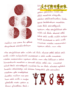
The writing is Photoshop Lorem Ipsum, which is a nonsense text generator in Adobe that cranks out paragraphs to fill page layouts.  The words are mostly Latin and are largely meaningless.

The typeface is Aceh Darusalam by Gunarta.  It's a phoney Arabic font with English letters fashioned to look Persian.  

Click on any image to embiggen:


Monday, October 24, 2016

1297 - Homemade Necronomicon IV

This is the next batch of images for Necronomicon pages.  According to lore, the Mad Arab Abdul Alhazred wrote his Book Of The Dead in his own blood and bound the book in flesh.  Yuck, right?  Abul Alhazred was the name H.P. Lovecraft made up for himself as a child.  I'm not sure whether I should be impressed or frightened by that.  Take your pick.

Instead of flesh and blood, I used an Epson colour printer and cheap printer paper.  I thought I had tested the ink for runs when wet, but as I recall I had tested an HP printer.  Epson ink will run a little if it gets wetted.  The cheap paper ran like Usain Bolt.  So, next Necronomicon I make, if I survive the process, I will include a special curse for Dunder Mifflin.  From now on, I will buy the highest quality printer paper I can find. 

Click on any image to embiggen:


Sunday, October 23, 2016

1296 - Homemade Necronomicon III

Continuing my series on building my homemade Necronomicon, I'll show you the pages I made for my Book Of The Dead.  There's twenty in all, so I will break up the presentation into parts so that my dear JSVB readers aren't overwhelmed by the occult (especially the ones that follow my iconography.  Gee: I kind of swing wildly between good and evil in my art, don't I?). 

Click on any of the images to embiggen them.