Sunday, April 28, 2013

775 - Fun With Robots III

 
Here's the next render pass for my Parisian robot rampage.  I added a couple of army guys to go with the jeep, and defined the wreckage on the Eiffel Tower.


Saturday, April 27, 2013

774 - Creating Aged Print Art

Since I've created a number of digital art pieces that look like print art, I thought it might be a good idea to show a method for easily creating art that looks aged using Photoshop.  Specifically, I am looking to reproduce something that would look like a pulp or comic book page from around the 1960's or so.
 
I've picked a relatively unremarkable JSVB entry to illustrate:
 
Line-art image.  Any image should work, as long as there are some parts that have flat colour. However, for a comic-book look I'll start with line art.
 
Optionally, you may want to replace the black line with something lighter.  I used Select Colour Range to select all of the black and then filled the selection with a dark grey-brown.  This is to simulate the nearly-black ink used in old comics and newsprint, called "Key".  Key black is dark enough to look like back, but is thin enough not to soak through cheap paper stock which could cause expensive jams in newspaper presses.  Against pure white, key black looks very dark. 
 
The first big step is to colour your image.  Since I use a stylus, I just "paint" it by hand.  You could also use the Photoshop Paint Bucket if you are a mouse user.  You need to divide your colours between "process" and "halftone" colours. 
 
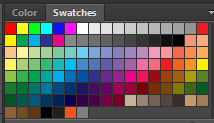
There are six process colours in Photoshop, simulating the six inks a printer is most likely to use.  They are at the top of the default Photoshop Swatch palette.  There are two sets of process colours: RGB and CMYK.  RGB colours are intended for computer screens, while CMYK colours are intended for print.  Choose which set you prefer.  Since I want to simulate print, I used the CMYK colours.  In order, the six colours are Red, Yellow, Green, Cyan, Blue, and Magenta.  The RGB colours are in the top row.  Then there are some greyscale swatches, then the CMYK colours. 
 
The RGB process colours start with Red, Yellow, Green, Cyan, Blue and Magenta.  Then there are 10 greyscale swatches.  Then there are the CMYK Red, Yellow, Green, Cyan, Blue, and Magenta.  The RGB colours are more vivid than the CMYK colours.

Open a new layer and use whatever process colours you want in your image.  Set the layer to "Multiply" so you don't have to worry about colouring over the lines.   Don't use any halftone colours on this layer:
 
I've used process CMYK red and cyan.  Pure red isn't a traditional CMYK colour, but it could be used as a custom ink.

 
Open another new layer on Multiply and colour the remaining image with your half-tone colours.
 
The flesh and aircraft are in colours intended for half-tone, since they are not process colours.  These colours are on a different layer than the process colours or the line art.
 
 
  They won't look half-toned until you apply the Colour Half-Tone Filter in the Pixelate menu under Filters:
 
 
Use the default settings because they are usually good.  You may have to adjust the Max. Radius pixels to make the half-tone look good.  Note if you are using a very low resolution image, the smallest pixel value may still make your image look blotchy.  Apply the Colour Half-Tone filter to the layer with the half-tone colours.  Don't apply the filter to any other layer:
 
 
The half-tone colours are rendered in classic half-tone.  The process colours remain solid.
The next step is to "age" the "paper".  Most cheap paper is seldom pure white.  I like using a cardboard texture:  either scan or photograph a blank piece of cardboard, or find a free-to-use image on the Internet:
 
If it's brown cardboard, use Saturation to make it more grey.  If it's grey cardboard, consider adding a faint dark orange hue.  The paper should look slightly brown.
Copy the cardboard image to a new layer on top of all the others in your artwork.  Set this layer to Multiply.  Depending on your cardboard texture, the image might be too dark.  Simply turn down the Opacity on that layer until it looks right. 
 
 
That's the basics of making an aged image. There's a couple more tricks you can try.
 
If you are using line art, consider applying a small amount of Gaussian Blur to make the lines less sharp. 
 
You can also scan or photograph rips you make in a blank sheet of paper.  Copy and paste the rips into the image.  Change the layer value to Luminosity to get a rip that looks good without having to apply a lot of corrective brushwork.  You may have to use an eraser set to around 30% to smooth any cutlines, though. 
 
The finished image.
 
Do you recall the step at the beginning where I created a simulated key black?  Since it's lighter than true black, you can see where the colours will bleed on top of it.  It's a sloppy effect, but intentional since it is difficult to avoid bleed when using cheap ink and paper.  It gives the image a retro "pulp" look, which ironically enough, adds aesthetic value.
 
Look carefully at the key black lines, and you will see intentional colour bleed from both the process and half-tone colours.  A small detail but full of retro authenticity!

I use these aging techniques a lot.  Since Photoshop breaks images down into very precise digital detail, sometimes I need these techniques to simulate the randomness of analogue printing. 


Thursday, April 25, 2013

773 - "JKE-RBN7 (#4D2)"


I don't often make changes to art pieces I have published here on JSVB, although many times I have been tempted.  In this case, I had the very strong idea just as I was getting out of bed this morning that I should alter yesterday's entry just a little.  I've learned to trust that intuition.

As well, I can take the opportunity to explain some of the design choices I made.  The first thing I did was to change the droid's name from JK-RBN7 to JKE-RBN7, which I hope reads better.  The black 'droid is loosely based on C-3PO from Star Wars (1977), as well as on baseball legend Jackie Robinson.  Presumably, JKE-RBN7 was designed and built with the intention to play baseball, something that would likely be well beyond the abilities of a typical protocol droid.  Being made out of metal, I imagine C-3PO could at least take getting hit by pitches to get on base. 

The foundation for this image is one of those old Star Wars collector's cards.  I recall having a few as a child: Tarkin, Leia, and I think maybe the Death Star.  When I ran an Internet search, I found one with C-3PO with a massive, um, golden rod.  It's easy to find if you search for the Topps C-3PO trading card.  In any case, the card frame made a life-like background for my art.  

I had to make several trials before I got the 'droid to look black enough without veering back into sex-toy territory.  Paint C-3PO black, and he starts to look an awful lot like "The Gimp" from Pulp Fiction (1994).   I was trying for something amusing yet respectful.  The Baseball Hall Of Fame provided some great source material for the pose, confirming for me that Jackie Robinson gripped the bat by the knob, the piece at the very end, which increases the whip motion of the bat.  

I "aged" the image in Photoshop in three phases.  One was to restore the look of paper by applying a cardboard texture overlay, the second was to create half-tone colours, and the last was to apply a little blur to reduce the sharpness of the print.  As part of the edit process, today I added a couple of the typical markings that Topps used on their cards that I had neglected in the previous iteration.  Fortunately, their font choices were easy to match.  The changes are small, but I hope they improve this image!

To see yesterday's version of JKE-RBN7, even though it looks a lot like today's version, please click here.  


EDIT: I know I spelled "Wookiee" wrong.  But did you know that the real Star Wars cards had all kinds of mistakes?  You can look them up.  


Wednesday, April 24, 2013

772 - "JK-RBN7 (#4D2)"


I am very pleased with how this piece turned out!  It combines two of my great interests, baseball and Star Wars (1977), with another interest I don't really much care for: collector cards.  But I am also interested in artwork and replicating the old-style comics of my childhood.  I remember many frustrating evenings back then at the kitchen table trying to achieve the line and form of the illustrations in the modest stack of comics I collected, and failing at every attempt.  Today, it's become a skill I can call upon at any time - something I should never take for granted, though. 
 
The concept of black 'droids is not new to JSVB. You can follow the train of thought by clicking here.


Tuesday, April 23, 2013

771 - Fun With Robots II


With some time today for working on this image, I set to add some new elements to the picture and refine others.  Now the Jeep, which I colour-corrected, is being held by massive robotic pincers.  The giant robot has a few more details, but some items like the missile launchers are just blocked in.  Noteworthy is how I used Photoshop's excellent Puppet Warp to break apart the Eiffel Tower in a pleasing way.  One or two more passes to add stuff and make fixes, and I should be done.  


Monday, April 22, 2013

770 - Fun With Robots I


Just as I was about to post this picture, my wife asks me why I am drawing a gigantic robot trashing Paris.  There's only one answer: the robot is supposed to be wrecking London.  Several hours into this project, I came to the crushing realization that I somehow mistook Paris for London.  Good thing I'm not getting paid for this one. 
 
Of course, this piece isn't done; I'm just posting progress.  I have to knock off the top three-fourths of the Eiffel Tower and drop them onto the city.  There have to be fires and plumes of smoke.  The robot, obviously patterned after "Mars Attacks!" (1962, 1997), will receive considerable re-working.  I need to draw some army guys falling out of the Jeep, and I have the idea  for a very particular Commander to ride in the bubble of the robot.  Like the other unfinished things I've posted to JSVB, I'll show my progress as I go to work on this thing. 


Friday, April 19, 2013

769 - "Commission: Nebula!"

Please click on the image to embiggen!
I completed this illustration of a nebula as a commission for my friend Sean.  He wanted a stellar background for a massive map for his Starfleet Battles war game.  This is one of the largest pieces I've ever produced, roughly 35" by 75", a big digital file I rendered in Corel Painter and Photoshop. 
Sean wanted a colourful, large composition something like the famous Mutara Nebula from "Star Trek II: The Wrath Of Khan" (1982).  In fact, I sampled the colour palette from the Star Trek movie to get my nebula colours.
In 1982, the American Space Shuttle program was just beginning.  It would be another eight years before the Hubble Space telescope would be launched.  Visual special effects for film were mostly hand-made.  Computer-generated effects were primitive.  So, lacking detailed cosmic imagery and without using computers, the visual designers for Star Trek relied on matte paintings to convey the look of space storms. 
I wanted to recapture that illustrative look for this nebula, so I intentionally avoided photorealism.  The easy solution would be to blow up one of NASA's public-domain space photographs to fit the file size.  I wanted something  that was more cinematic and recognizable as being crafted by hand.  I felt that would make the piece look more dramatic.
I also wanted to have areas of the map that featured expansive starfields, so I tried to design a nebula that would not fill the entire map.  Most of the Mutara Nebula scenes show the gas cloud filling the screen.  My first attempts replicated that look, but it was too broad.  The lower left-hand corner represents the area closest to the Mutara design.  I pulled back the point of view and reduced the nebula into a curve that naturally seemed to close in on itself in a massive swirl.
My theory is that the nebula is created by a close pair of neutron stars that are in the process of colliding.  They are consuming the gases emitted when they went nova to become neutron stars.  A third and perhaps fourth companion star survived the original nova blasts, but are being ripped apart and consumed by the tremendous gravity well created by the neutron star collision.  A neutron star is formed when an aging star dies by implosion:  extra mass is ejected into space to form a supernova, a gigantic glowing cloud of ionized gas.  The nova process can cause a neutron star to achieve hypervelocity, like a cosmic billiard ball.  If two neutron stars fall into each other's gravity well, they will create a singularity, which is matter so dense that even light cannot escape from its gravity - the famous black hole.

I had the image printed on durable vinyl so that it could be used as a game board.  The colours are striking, although they are much deeper in print than they look on the computer screen, a factor I purposefully designed into the image.  It looks equally enthralling as a game board and as a wall-mounted conversation piece.  Anyone interested in collecting artistic space imagery would be pleased with this item.  I can have it printed and shipped anywhere, and would be pleased to accept orders for more nebulas! 


Thursday, April 18, 2013

768 - The Silly Season


British Columbia voters should be forgiven for not understanding that our general election, the one to decide provincial politics, only began three days ago, and not months ago when the shadowy Concerned Citizens For British Columbia (CC4BC) saturated local television with attack ads.  

Just who are the so-called CC4BC?  They certainly didn't seem concerned when the HST brought British Columbia into the eye of a perfect storm of government lies.  Nor did they seem concerned when the HST was voted down by plebiscite, a national first.  CC4BC was at the very forefront of the rearguard when Japan needed our aid after their horrifying earthquake, meaning they did nothing that was apparent to anybody. 

CC4BC (the acronym) is suspiciously close to the early version of the B.C. Liberal campaign slogan "C.C. For B.C.", which was coined back in the days when the Libs sought to put as much distance between themselves and Gordon "03-02659" Campbell, the mitten-handed Premier who scored the all-time lowest public approval rating in the history of North American politics.  In the two years or so that C.C. has attempted to lead the Liberals, and by extension the province, her party quietly decided to drop Christy Clark's name from the official logo.  So while nobody is rallying behind obsolete C.C. For B.C. battlecry, we do have CC4BC showing up on our televisions every twelve minutes or so.  

CC4BC is a political communications organization.  Their primary goal is to spread the gospel of the B.C. Liberal Party.  Mostly, we have been subjected to months of pro-Lib television ads and an Internet media campaign which have tried to frame C.C. and her crew in the most positive light possible.  

Then there are the attack ads.  Astoundingly, CC4BC has spent a documented $16.6 million dollars on ads that directly attack the New Democrat Party (NDP) leader Adrian Dix.  What CC4BC won't reveal is if the $16.6 million was raised through private means or if the money was pulled out of public tax revenues.  I am trying to imagine the B.C. multi-millionaire so outraged with the NDP that they would willingly subject citizens to dozens of repetitive attack ads each day.  I know I've seen the ads enough times that I have the text memorized.

This is important: the substance of each attack ad is that when Adrian Dix was a part of the NDP when they ruled B.C. in advance of Campbell's Libs, he was involved in a scandal where he falsified government documents, was caught in the lie by the RCMP (police) who had physical proof of his transgression, and then resigned from his post in utter defeat while clutching the typical obscene severance bonus that politicians of Dix's ilk will gladly take as their entitlement no matter how horrified or disgusted the voters are.  In short, the attack ads are completely factual, and they describe in lean, accurate terms exactly how Adrian Dix came to be forced to resign from high office.  

So, I have to be clear: as repulsed as I am by months of Liberal attack ads, I am equally disgusted by the leadership qualities of both the Liberals and the NDP.  I cannot condone the $16.6 million spent to attack Adrian Dix on television, especially at a time when the Liberals are cutting funding for the BC film industry.  On the other side of the coin, how can anybody support Adrian Dix, who wilfully forged government budget documents in a craven attempt to keep his cushy job?   

Just how deep do the lies go?  Now that the silly season, the official election hustings, has begun in earnest, this is exactly the kind of question that will never have a satisfactory answer for the voting public.  

My thought:  all this election will serve to do is exchange one set of flaccid boobs in office for another.  While you could interpret that as a sexist jab at C.C., please consider the leaders as political boobs rather than as saggy mammaries.  Or not.  

For another take on breasts in politics, please take a gander at these by clicking here.

See Premier Mittenhands and find out the significance of 03-02659 by clicking here.

Finally, a couple more C.C. cartoons.  At least she's kind of fun to draw.  Cartoon #1: please click here.  Cartoon #2: please click here.

Regrettably, I don't have any pics of former media darling Pamela Martin.  I'm not certain anybody remembers what she looks like anymore.  All we know is that she's still  caucasian and that she draws a confirmed $130,000 yearly government salary for doing whatever it is she's doing for the Libs.  Dotting the all "i"'s on the Liberal letterhead by hand, maybe. 


Monday, April 15, 2013

767 - Today In Boston


A nearly unimaginable tragedy in Boston, Massachusetts: bombs are set off at the finish line of the famous Boston Marathon.  The news media reports that at least three people have been killed and over a hundred maimed and injured: a bloodbath. 
 
Far from Boston, we ask our questions.  Why has this happened?  Who is responsible?  What can we do?   Pray, of course, and offer  what support we can.
 
This American flag design is the marriage of two resources.  I found an amazing flag image courtesy of creativewebconnection.com.  The pipe bomb, believe it or not, is a decorative piece in gold, silver, and platinum by Lisa Kirk and Jelena Behrend.  I suppose if you're going to make a pipe bomb these days, it had better look great.  I altered and composited both images in Photoshop.


Saturday, April 13, 2013

766 - Easter Egg

Today is Ungood Art Day on JSVB, traditionally the thirteenth day of every month.  Here, I feature my own art efforts that for whatever reason completely failed to be any good.  Of course, it's one of the most sought-after features of JSVB.  Secretly or not, almost everybody loves a train wreck as long as it happens to somebody else. 
 
Today's JSVB Ungood Art features a completely naked lady.  Since it's so Ungood, I'm not worried that anybody would consider the image pornographic, or even anatomically similar to pornography:


Once again, if I have failed to mention it before, I must give my deepest thanks to the art models who pose for students and then have the work turn out like this.  What was I thinking when I drew this?  Hot chick?  I don't really remember, although I think I was egged on by the life drawing instructor to shell out this particular design.  And this work is one of my larger drawings as well: poster sized at least.  It's definitely the conversation piece to bring anybody's living room together as a decorative focal point. 
 
Easter eggs are hidden features such as jokes or messages within modern media, including art, music, movies, and video games.  Since this is the Ungood Art Day closest to Easter, we have my JSVB version of the Easter egg, not all it's cracked up to be I'm sure. 


Friday, April 12, 2013

765 - World Hamster Day


My wife tells me that April 12th is World Hamster Day!  From what I know, this was the day back in 1930 when zoologist Israel Aharoni first captured Syrian hamsters in the wild for breeding (although most of the animals escaped the Professor's cage through a hole in its bottom - how typical).  Almost all domesticated hamsters in the world are descended from this brood! 


Wednesday, April 10, 2013

764 - Ten Minutes To Disaster


Sketchbook work of a particularly troublesome dog.  In ten minutes, the whole thing goes horribly wrong.  Two hours later, everything returns to normal.  Lucky.


Monday, April 8, 2013

763 - I Run This Town, See!


When nobody was looking, my wife and I sneaked into the City Council chambers and hijacked the Mayor's seat.  "I run this town, see!" I sneered in my best Jimmy Cagney.  Then, "Take my picture, honey, quick!".  Finally a quick, furtive exit, eyes on swivels to make sure we were not seen.


Sunday, April 7, 2013

762 - Hellas Planitia


Let's go for a long walk on Mars, I'd love that.  I'll bring the wine (red of course).


Friday, April 5, 2013

761 - Nebula Practise


Certain events have come to pass that have made me realize that to prepare for the future I should practise drawing nebulas, those distant glowing space clouds.  This attempt was less than stellar. 


Wednesday, April 3, 2013

760 - April Fool's ET Evidence


On April Fool's Day of all days, I finally managed to photograph a UFO.  This picture was taken near Parksville, on Vancouver Island.  This is an actual photograph.  There are no Photoshop tricks involved in presenting this picture.  The only change I made was to lower the image resolution so that JSVB doesn't load slowly.  I have not adjusted the contrast, the curves, the gamma, or any of the colours.  I used no dodge, burn, smudge, sponge, or any filter or brush of any kind.  Cut and paste tools were never used on this photo, neither is it cropped in any way.  I did not even put my usual visible label on this pic (my Chinese name). If you want the high-resolution original for your own needs (worship, debunking, whatever), please send me an e-mail and I will reply with a hi-res copy. 
 
Even so, check it out.  The photo has a little motion blur because I was taking a handheld shot under twilight conditions with a slow shutter.  There is no way someone could have thrown this object into the air and I would end up with this picture: either the object would then be more motion-blurred within the frame on account of the slow shutter, or else the colours would be much darker if I used a faster shutter and lower aperture. The object is standing still relative to me, but the blur is equal across the entire frame.  Use Photoshop histograms, and you will see that the curves are natural and do not show any artefacts from digital effects.  There are no digital seams, no fake shadows. 
 
You tell me: real April Fool's photograph or real April Fool's hoax.  I do have another angle of this scene, but it's not nearly as good a shot as this one.  I promise to post it later.  One spooky aspect is how closely this object matches the completely fictional extraterrestrial vehicle I had designed for JSVB Post #649 "RAF Versus UFO", which you can see by clicking here.   Watch the skies, but also watch JSVB! 


Monday, April 1, 2013

759 - Koala In Fisherman's Friend Sauce


This JSVB post has a recipe for Roast Koala Bear In Fisherman's Friend Sauce.  If the idea or the imagery of this offends you, do not scroll down.


Ask anybody who knows me well enough and they will tell you that I have mentioned that I would like to eat a koala bear.  Especially during cold and flu season, koala meat would be outstanding.  Think about the only thing a koala eats: eucalyptus leaves.  Then think about what goes into cough syrup. 
 
I once came across the wilderness adventure story of a big game hunter who at the turn of the 19th century, became lost in the Australian outback.  To avoid starvation, he captured, cooked, and ate a koala bear (which is not a bear at all but a marsupial, and closer to a wombat than a grizzly).  He reported in his journal that the meal tasted like every throat lozenge he had ever eaten in his lifetime, except all at once. 
 
Killing koalas is illegal in Australia, as far as I know.  There don't seem to be any recipes for them, even if they happened to be road-kill or harvested after dying of old age or great sex.  I've had to adapt from what I know from "The Joy Of Cooking" by Irma Rombauer and Marion Rombauer Decker. 
 
ROAST KOALA IN FISHERMAN'S FRIEND SAUCE


1 small koala (5-7 lbs meat)
1/2 cup cider vinegar
1/4 cup honey
1/4 cup brown sugar
1/2 cup grapeseed oil
1/3 cup seasoning salt
1/4 cup dry white wine
 
4tb unsalted butter
4tb flour
1 cup cream
1 1/4 cup chicken broth
1 tsp lemon juice
1 tsp minced ginger
1/2 tsp horseradish paste
2 x crushed packages extra strength Fisherman's Friend lozenges (25 g per package)
2 tb anise seeds
2 oz. vodka
1/2 tsp. hot chili sauce
 
Skin and gut 1 koala.  Mix the oil, vinegar, honey, and brown sugar to make a marinade; coat the koala meat and wrap tightly with plastic cling wrap.  Cold-marinate for 24 hours.  Remove wrap and discard marinade.  Sprinkle salt on exposed meat.
 
Roast the koala in a covered pot for approximately 4 hours at 375°F.  I like to place 1/4 cup wine on the bottom of the pot before inserting the koala.  You can put the koala on a bed of peeled carrots to prevent it from touching the bottom of the roaster pan. Treat as you would pork roast.  Baste every hour with some chicken broth, making sure to reserve at least 1 cup for the sauce. 
 
When the koala is nearly done (test for doneness with a meat thermometer, use "pork" as a guide), melt the butter in a saucepan under medium heat.  Stir in the flour to make a paste.  Slowly pour in the cream, stirring as you go.  Continue to stir and heat the mixture for five minutes.  Slowly pour in the remaining broth, stir and heat.  Stir in the crushed lozenges, ginger, lemon juice, horseradish and anise seeds.  Stir in the vodka.  Turn sauce to very low heat and allow to sit until the roast is done.  Add the chili sauce to taste. 
 
The meat should be tender even if it is a bit dry.  It should taste and smell like cooked medicine.  When paired with the sauce, the meal will be like eating Jägermeister, with all sore throats and runny noses but a distant memory, but without the alcoholic buzz.  Probably.  Serve hot on April Fool's Day!