Showing posts with label Art School 101. Show all posts

Monday, September 17, 2018

1550 - Varnished Truths


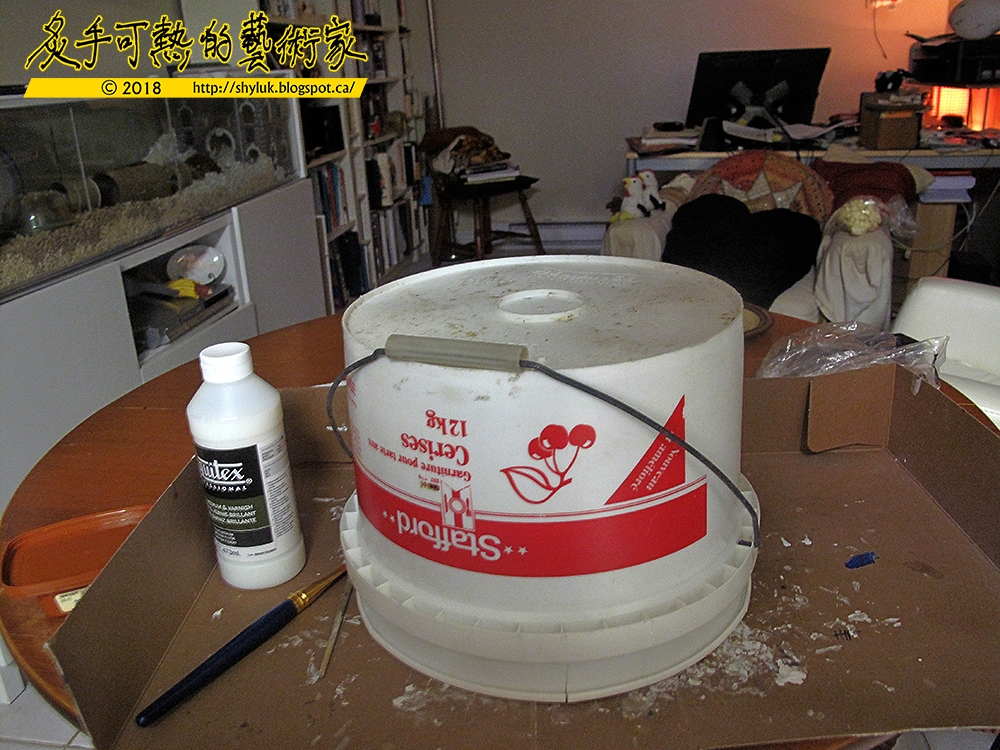
So this is the varnishing process.  Varnish acts like a magnet to airborne debris like dust and hair, so the artwork should be hermetically sealed for as long as possible until the varnish dries.  The result is an hours-long meditation on what it takes to eat twelve kilograms of cherries.  I doubt that I have eaten a single kilogram of cherries in my lifetime, I don't like them very much.  The pail came from a restaurant dumpster, I think, or was given to me empty.  Right now beneath the upended pail are the globes with still-wet varnish.  The varnish will seal the artwork for posterity and freshen the colours.  Since I am using glossy varnish, it will also balance the parts where the labels were too shiny.

Liquitex again.  The reason I am gravitating to Liquitex is that the local art store runs out of Golden and the other product lines.  I really should get up earlier in the morning before all that is left on the shelves is Liquitex.

The Liquitex varnish is okay.  As a big plus, it doesn't need to be mixed or thinned.  Having to do mixing means there's a chance of introducing air bubbles into the varnish which can be nearly impossible to dissolve.  This varnish also goes on in thin layers.  For flat artwork, you'd want a thick varnish so that you only need to apply it once and it dries flat and smooth.  Thin varnish shows brush strokes, but on the other hand it dries much faster and it won't run along non-flat surfaces (globes consist entirely of non-flat surfaces).  So, thin varnish needs multiple applications.  Liquitex gets cloudy the more layers you add, so there's an upper limit as to how much varnish I can use.  After I lift the cherry bucket in a few hours, we'll know how the final result looks!  


Saturday, August 18, 2018

1539 - Bespoke Worlds: Mongo V


Less is more, perhaps.  I need to remember that this project is experimental, and with trial and error there are bound to be mistakes.  

On the plus end of the scale, I restored the colour of the ocean, adding some nice cartoony swirls.  Oceans should always swirl on globes, I think.  On the minus end of things I forgot that globes never dry flat, so a fair amount of the wet ocean migrated from the northern hemisphere onto the southern continents where it pooled and dried all over Tropica, The Great Mongo Desert and Naquk.  I spent the day repairing the flood. 

My next intention was to line the continents with gold, which you can see above.  I'm used to using the gold pigment from Golden Acyrlics (a bit of co-incidence in the name), but at the art store I got sweet-talked into buying Liquitex.  Liquitex is cheaper than Golden by a few dollars, and it looks better.  Unfortunately, I discovered that it doesn't flow better.  I must have done something wrong because the paint would form gelatinous lumps when thinned.  The thin paint was too thin, and the lumps were too thick albeit they were usable.  I should have remembered to use acrylic medium which is the translucent liquid part of acrylic paint that binds the pigment.  Medium is cheap and easy to find at any art store. 

Painting with thick gold paint yielded thick lines.  The effect is unsubtle, especially on these small globes.  On a larger globe, there would be no problem.  I spent some of the day thinning out the more obvious lines, but I'm not going to go over the entire globe with this fix.    

The next step, again highly experimental, will be to create labels to put text on the globe.  I really hope it works! 


Saturday, August 11, 2018

1534 - Bespoke Worlds: Mongo II


I've used modelling clay to form the continents on the Planet Mongo.  Slartibartfast was right: it is fun to do the fiddly bits on the fjords! 

I returned the globe to its stand because I was afraid I had made the mountains too lumpy for the globe to turn.  It was true, the volcanoes of Tropica got stuck on the arm of the stand.  

A word on the clay I used.  I picked Das, which is non-toxic air-cured modelling clay.  Trivia: I had classes in University with the son of the inventor of Das clay.  The family was very wealthy from the sales of Das - anybody in the Arts knows that the real money is in selling art supplies - so their son was able to take advantage of the best instruction.  I recall him as being very conscientious and generous, a genuine nice guy.  

I'm used to working with Super Sculpey - see my homemade Neconomicon on JSVB Post #1294.  However, Sculpey has some drawbacks: it needs heat to cure and turpentine to thin.  The heat would melt the globe which would be okay if I was modelling the Klingon moon Praxis.  Turpentine is a toxic irritant.  Das, on the other hand, is not toxic and it uses water for thinning.  

I was worried that the continents would not stick to the globe.  Das on its own is a little tacky, but it isn't sticky.  Slathering the globe with water and wetting the pieces of Das cases it to thin a little, and when Das is thin it's very sticky.  Wet Das also binds strongly to whatever it dries to, mostly my fingers and modelling tools.  So, Das is messier than Sculpey, but I simply cleaned my fingers and tools with a wet rag.  

Das has a peculiar sticky sliminess when thinned and worked, so it's not exactly like clay.  After it dries for an hour or so, it becomes malleable and very clay-like.  If Das dries too quickly, it will crack, so I kept the globe in a container with a moist paper towel to make sure the dry-cure went as slowly and evenly as possible.  Das does shrink as it dries, but my continents were small and thin enough that the shrinkage was barely noticeable.  Proper curing takes around 48 hours.  

I should have taken pictures of the sculpting session.  My hands were too gunked up to work the camera, though.  Das goes on light grey and dries to ivory white. 

So, back to the mountains.  Since they were too tall, I had to sand them down.  Cured Das takes to sandpaper very well, so it wasn't difficult to abrade the mountains and coastlines down to a manageable level.  The picture above is before the sanding, so the finished globe looks quite a bit less lumpy. 


Friday, August 3, 2018

1530 - Operation Slartibartfast II

Here are three globes primed for painting:


When I discovered that gesso binds to plastic, I was very excited.  I am experienced with painting acrylic on gesso, so by priming with gesso I can use non-toxic paint which is a big deal for me. 

So what is gesso?  It's essentially thin paintable glue mixed with white chalk or gypsum.  It dries to a hard matte surface that is ideal for acrylic paint.   Gesso is white, but it can be purchased in colours or tinted by mixing in the acrylic paint of your choice.  I like white because it will make the colours I paint over top of it bright.  

It took around a day to prime these globes.  I made several mistakes as I did this.  Perhaps the biggest mistake was to prime the globes before putting on the continents.  I plan on making the continents out of modelling clay.   If I had attached the continents first then I could have primed the whole thing...?  Well, maybe not, since sanding the continents would be difficult and if they fell off anyways I'd be stuck re-priming the broken parts.  

Another mistake was using masking tape to cover the coin slot (these globes were originally banks). The tape was thin and it allowed itself to be primed with gesso, which was what I wanted, but as the gesso dried the paint sucked up some of the moisture and wrinkled.  

Finally, cheap globes make for cheap art.  There's a big seam in the plastic around the equator of the globe; you can see that in the photo above on the globe to the farthest right.  I painted six layers of gesso over top to try to smooth the seam, and it helped a little.  I should have taken another day to do six more layers.

After the gesso was completely dry, I used 100, 300, 600, and 800 grit sandpapers to grind out the impurities in the surface of the gesso and to make it smooth.  On a religious icon painted on a flat board, you can allow the gesso to dry flat.   On a globe, there are no flat surfaces, so the gesso tends to creep towards gravity as it dries, making ridges.  More sanding fun there.  


 In the picture above, I point to some of the ridges in the gesso.  I could have added more coats of primer, but I think I will simply drop a continent on that spot to cover it.  

Speaking of continents, my next step is to draw on the globe to block out where the continents will go.  I'll save fabricating the continents for another day as company is coming over to visit and I doubt they want to watch me swear at my art project.  


Monday, June 18, 2018

1517 - Monaco Colour Test


Some time ago, I received a commission to paint a poster to commemorate the Formula One race in Monaco.  Only, it's not the Formula One race, but the Formula De race, which is really a board game care race played with dice and markers on a tabletop track.  Even so, I wanted to make this poster look really official. 

I've mentioned on JSVB before my admiration for master illustrator James Gurney and his instructional books.  For this poster, I tried to employ as many of his trick of the trade as I could.

The first step was to create a mock-up model of the scene, which I did by making a photo collage of a Monaco street scene in Photoshop.  Some of the buildings you see in the picture line the route of the real race, but most are cut and pasted from other Mediterranean playgrounds of the rich and famous.  I used Photoshop's Distort and Perspective edit functions to make the buildings fit into the scene.  Then, I figured out the lighting and how the sun would stream down the road. By this time, I had an exciting and dynamic composition laid out.

James Gurney gives very strong lessons on how to create a realistic colour palette and use lighting to make the colours pop.  I started out with a reasonable palette, but the shadows were too muted and the bright colours weren't bold enough.  So I used Photoshop to advance colour vibrance to its maximum and saved that picture.  Then I doubled the vibrance by maxing it out again.  The colour set I ended up with is close to what you see in this picture. 

I used it to sample the colours I wanted and painted over my photo collage to create this colour test image.  I was very happy with how this turned out on the first try.  This picture is around the size of a postcard though; the final project was to be poster-sized!  


Saturday, February 24, 2018

1481 - Mona Sylvia - Foreground Lit


You are looking at the third and final experiment in light and shadow featuring my model, the Mona Lisa of the modern day, Sylvia. 

This time around, the foreground is lit while much of Sylvia and the background are in darkness.  I figured that the table would reflect a fair amount of light into Sylvia's face and hair, so I sketched in some details to make her stand out from the flat background.  The thematic focus is on Sylvia and that she is drinking, so this time the light source helps push the narrative.  Unimportant things in the background are now invisible.  I think this gives Sylvia  an air of mystery.

So that concludes my experiment!  I believe I learned a few things about light and shadow in composition.  It's not as black-and-white as I first thought:  sometimes the shadows and white areas help to push the viewer into considering the motivations in the scene, while other times they obscure details that may have been necessary to the picture, or worse point to details that are not relevant.  The trickiest parts to draw are the transitions from light to dark.  Sometimes the shadow swallows up too many lines, and sometimes the light brings out so many lines that the picture becomes too busy.  I figure it's better to have too few lines rather than too many.   

I had been wanting to complete this project for several months: thanks to Earl and Sylvia who provided their kind permission to use their picture as my reference. 


Friday, February 23, 2018

1480 - Mona Sylvia - Lit Midground


This is the second of my experimental series of illuminating a picture of that girl with the enigmatic smile, Sylvia.  

I think out of the series this is my favourite, perhaps because it's also the most conventional.  It holds  close to the source photograph (JSVB Post #1478, please click here).  I tweaked the light source so that the drinks and Sylvia are in the lighted area, while shadows add necessary volume to the composition.  The effect to me seems both balanced and dynamic.


Thursday, February 22, 2018

1479 - Mona Sylvia - Lit Background


This is the first in my series of experiments with light and shadow in composition.  The model is la Giaconda of our modern day, Sylvia.  

In this version, Sylvia and her table are thrown into deep shadow, while the background is fully lit.  This is supposed to call the viewer's attention to something essential in the illuminated area, only I didn't draw anything of importance there.  I guess I should have.  Well, you could use the light to find your way out of the room. 

Since the subject and her props are all in deep shadow, I had to use some fine white lines to make that part of the image readable.  The effect is brooding.  


Tuesday, February 20, 2018

1478 - Hatching My Plan

JSVB Post #1466 was a contour drawing of my friend Sylvia.  In today's JSVB post, I want to revisit that picture to bread it down a little. 
 
First of all, here is the source photo of lovely Sylvia as shot by her husband Earl:
 
Photo used with permission.
 
I was taken by the composition of this picture, although poor Sylvia is trying to get some rest at the end of a long day.  Normally, she's smiling.  What I like about this picture is how the light from the window plays across the subject.  It's very dramatic!  

If I had taken the photo, though, I would have had the sun hit the drinks and illuminate Sylvia's face.  Stupid sun, being in the wrong position!  If I could, I would have moved the table around to make the shadows hit precisely.  Failing that, maybe gigantic proton thrusters mounted on the Earth's crust would have shifted the planet enough to make the sunlight fall correctly.  Either way, Sylvia would remain equanimous as the Mona Lisa.  

Far easier to make a drawing, which is what I did back in JSVB Post #1466.  I'll repost it here:  

Print this out!  Colour it in! 

After posting this drawing, I received comments about all the hatching work.  I'm not much into hatching - using small, repeated lines to create a mid-tone value in a line drawing - so this is something I would like to learn how to do well.  The intent of the drawing wasn't to practice hatching, but to use this artwork as the base for working out schemes of light and shadow like in the photograph.  I'll post my results in the next few days!

More on the hatching.  There were three areas I felt that needed mid-tones: the hemp curtain, the wicker partition, and the pebbled tabletop.  I've broken down these three hatches in this illustration below:

From top to bottom: 1. Wicket hatch 2. Hemp hatch 3. Circular pebble tile 3a) Circular pebble tile solution by K. Neko, 4) Original pebble tabletop

To speed things up, I made simple hatches in Photoshop and then tiled them.  You can see clear linear hatches for the wicker and the curtain: they are basic repeated patterns.  I used Photoshop's distortion tools to make the hatching fit the perspective of the picture, and in the case of the curtain I warped the lines to make the fabric appear to curve.  No sweat!  

The pebbled tabletop was a lot harder to finish.  I really liked the contours of the small stones, but tracing them all would be time-consuming.  I opted to make a selection of each stone and combined all of the selections.  Then I used Photoshop's stroke command to automatically generate the lines.  Unfortunately, there were dozens of imperfections in the selection that the smoothing algorithm could not fix.  I ended up making the repairs by hand, which took a couple of hours.  The results still looked awkward, as you can see from above.  

I decided to simplify the stones into circles which would look cleaner.  I wanted to make a repeatable tile of circles of varying diameters.  At first, I tried freehanding the arrangement of circles, but as I worked I recalled reading an article about a computer program that would arrange circles efficiently into a square space.  As it turns out, this is a very complicated task for a computer.  Sorting applications have a lot of difficulty understanding the difference between a circle and a square, as the math to optimize both becomes complex.  

The small grey image is a solution from Kuroi Neko, who is a programmer at Stack Overflow.  The solution is not to use a rectangle as a boundary, but rather a shape made from the edges of four nearly infinitely large circles, which in practical terms amounts to the same thing as a rectangle.  Using this new system the program will run very smoothly.  I used this application to generate the tile and then duplicated it a few times in Photoshop to  make the tabletop.  The clean circles replace the irregular rocks and they look good.  

The next three JSVB posts will show the results of my experiments in light and shadow using this picture.  Stay tuned! 


Friday, January 5, 2018

1456 - Drills III


This drill uses light, medium, and dark shading to describe cubes floating around a central light source.  It shows me I should probably focus more on perspective drills (cube drawing!) than shading drills. 


Thursday, January 4, 2018

1455 - Drills II

Another hatching drill.  Again, the hatching goes from deep to light.  This time, I use hatching to describe a curved surface.  One is positive, the other negative.  You can decide which one is which. 

The key is to decide exactly how dark and how light the region is to be.  Start with the dark, and make a small area exactly as dark as is needed, maybe even black.  Then partway between the darkest and the lightest area, hatch half as dark as the darkest area a small part of the medium value.   Hatch the medium value all the way to the dark value.  Then gradually build up the area nearest the dark value with more hatching.  As you go, you should see the medium hatch become darker.  Strive to make the darkest part near the black edge or core.  That's half the shading.  

The other half goes from medium to light.  Partway between the medium area and the light, apply a small area of hatching that is half as dense as the medium hatch.  Build that into the medium hatch the closer you get to the medium zone.  Then apply light hatching to finish the transition from light to medium to dark hatching.  


Wednesday, January 3, 2018

1454 - Drills I


Although this looks like New Year's resolution fervor, the timing for this JSVB post is coincidental.  I've been going through a long slow patch of work, so sometimes doing artistic drills helps me to create fresh material.

This drill is to make value changes from deep shading to medium to light using hatched lines.  In animation, I very seldom used hatched lines since every line that goes into the drawing must be accounted for and animated. Those were the old days.  Now that I don't have to worry about line counts, I have begun to study how to make effective hatches with lines.  Drills help to tighten up these otherwise vague skills. 


Sunday, May 14, 2017

1375 - Zones Of Shade In Ink


A combination of lack of meaningful work and a willingness to be distracted that goes beyond normal reason means that I haven't posted much to JSVB, and I certainly haven't been drawing anything exciting.

I decided to go back to art school basics.  Above is a drill to practice making grades of shade.  It's pretty easy to do this with the computer, harder to do it with paint, and kind of tricky with pen and ink.  

The exercise begins with defining the ends of the scale: pure black and pure white.  Then you discover the intermediate shades.  With a computer this is easy, since most colour scales range as defined bit elements numbered from 0 to 256.  If you want a particular value, you can arrive at it mathematically: 0 is white and 256 is black, so if you wanted something halfway in between, you'd enter a value of 128, which is 256 divided by two.  

Ansel Adams, the master of photography, used a zone system that works much like the computer bit range.  Black is 0 and white is Roman numeral X.  Adams' system has eleven values, so that the mid-range value V is in the center of the scale.  Adams would carefully measure his subjects with a light meter to make certain all eleven values were represented in his photograph.  Human and animal subjects tend to fidget when being metered so much, so Adams used this system best on his gorgeous landscapes.  In order to make the subject fit all eleven zones, he adjusted his camera exposure to try to account for as many as possible, similar to using the histogram function in a digital camera.  If there were zones missing, he would add them during development using dodge and burn techniques.  In this way, aligning the picture's value scale to the zones was both additive and subtractive depending on his method.

There is far more to the Adams Zone System than I will mention here.  Although there were eleven values to the range, only the middle seven were practical.  This aligns with what I have learned about painting, in that you can lay down a mid-range colour as your base value, and then either lighten it or darken it by three steps each.  

With paint, you can change the value by tinting it lighter with white or shade it darker by adding black.  That's the very basics, anyways.  It's also an additive and subtractive system, since you can always adjust a colour by using tint and shade.  

Ink is difficult to translate into zones since it's only additive, a one-way trip.  I suppose you could subtract from back ink by using white ink,  but since a pen is a linear tool, you are simply adding black or white lines depending on ink.  Once the ink is laid, you cannot subtract from it.  So, to create zones, you start with white and add a few lines until you get your next zone. You add more lines to the second zone and so forth until you get all the zones you need. 

Since creating zones with ink is laborious,renowned illustrator Alphonse Dunn encourages us to use just six a, b, c, d, e, and f values as I have above.  This eliminates the mid-range value (c₁, pictured as "cd"), but it has the benefit of making the process of shading easier.  

The first two values (a,b) can be condensed to make an even simpler value: black.  The next two values (c,d) can be condensed to make the mid-range grey.   The final two values (e,f) condense to make white.  Now we have a compact three-point scale which can be used to define the values of the portrait much more quickly than Adams' method.  Since all the shades have to be rendered by hand rather than through the process of photography, simplicity is golden.  You start with white and work your way up to black using first the three point scale and then by refining the shades using the six point scale.  


Saturday, October 22, 2016

1295 - Homemade Necronomicon II


I thought they smelled bad on the outside!

I am continuing my JSVB posts on making my own homemade Necronomicon, or Book Of The Dead.

Once I fashioned the Super Sculpey into an evil face on the front cover of my Necronomicon and an evil spine on the back...  ("What is that?!" my wife demands.  I tell her: "Don't you know?  All books have spines!"  She leaves me alone for the rest of the day after that, which is just as well all things considered) ... I had to bake the Sculpey to harden it.  That meant putting the entire book into the oven.  

Super Sculpey should be baked for around half an hour at around 250 degrees.  I did this a day after applying the turpentine so that the turpentine would have a chance to dry.  Even so, I filled the house with the characteristic reek of overheated Necronomicon.  It was very fortunate (or evil) that my wife was out of the house long enough for me to use all of the fans on full to dissipate the odor.  

Pro tip: cheap duct tape melts when baked at 250 degrees for around half an hour.  A good example is the cheap duct tape I used to repair the book when I made a crooked cut taking out its original pages with a circular saw.  The tape goo melted onto the oven rack.  I was able to scrape the tape goo off before my wife returned home, thank the Necronomicon.  Or thank goodness, take your pick. 

Since I had the oven on, I decided to do some more baking.  I know the method for easily creating paper that looks ancient by soaking the pages in coffee and baking them dry.  

First you have to make coffee, which for me is the hardest step.  I don't drink coffee at all.  I've only made three cups in my lifetime, and after the last one my father (who I made the coffee for) made me swear upon my honour never to make another cup of coffee again.  


So here on the stove is a pot of art pigment, and not coffee.  Once cooled, I poured it into a baking tray and submerged my Necronomicon pages.  I was careful to wet both sides of the paper, but I did not leave the sheets in to soak as I wanted them to dry quickly.  


I baked the paper on a clean cookie tray at 420 degrees, which seemed to be just right to dry the paper in two minutes without scorching (that happens at 451 degrees, apparently). Once all four corners lifted off of the sheet, I knew the paper was done.  


Friday, October 21, 2016

1294 - Homemade Necronomicon I

Hallowe'en approaches, and this year my wife and I decided to spend some money on costumes and decorations.  One item I dearly wanted to get is something that isn't easily bought or sold: a Necronomicon, or Book Of The Dead.  

Originally a fearsome invention by H.P. Lovecraft (an item that Lovecraft based on his own bizarre research into the occult), the Necronomicon has gone from a grimoire of dark witchery to a pop culture icon thanks to the popular "Evil Dead" franchise of horror-comedy movies, games, and TV shows.  

That's pretty much the Necronomicon I want.  Last year, I took my wife to see "Evil Dead: The Musical" (please click here to see JSVB Post #1076), and they had a really nice Necronomicon stage prop.  I guess that's where I figured, "if they can do it, I can too".  

There are a few guides on how to build your own Necronomicon on the Internet.  I stayed away from the ones that would be powerful enough to conjure demons and settled for one by knowledgeable Reid Carter, who built his own Necronomicon in the likeness of the one in the movies. 

My art supplies at hand were different from Mr. Carter's, so I diverged from his course wherever I had to to keep my budget down and my sanity up.  


The first step was to re-purpose an old book.  I had this one on my shelf for years, and it happens to be really close to standard paper size which was helpful since I wanted to use standard paper from my desktop printer.  The cover is a bit shiny, so I decided to sand it down with rough sandpaper to make it rough.


Sanding off the shiny part was strange.  I ended up peeling off the entire cover, which left a very rough composite of cloth and paper underneath.  It's sort of like the material for bandaging a mummy.  Although it was very fibrous, the "new" cover has an organic-looking texture, which should help.

Oh yeah, and the book was filled with pages I no longer needed.  I decided to cut them all out en masse.  I know now from experience: you haven't defiled a book until you've cut out all its pages using an electric circular saw.  Unfortunately I'm lousy with power tools, so my cut was not straight and I ended up damaging the book's spine.  I fixed it with duct tape.  Hooray for duct tape!  I put the discarded pages in recycling.  Now the garbage collectors can read about potato production in Peru, but some benighted Grade Seven schoolkid cannot (for it was also a library book that I gutted.  Evil, yes, yes, I know, I know already).

 
The next step was to apply the features using Super Sculpey polymer clay.  Sculpey is tremendous since it's pliable and workable until you bake it.  Then it hardens into plastic.  

That's what I recall from art school, anyways, which was around twenty years ago.  I bought a box of Sculpey for use in class back then but never opened it until today.  When I did unseal it, I found a brick rather than malleable clay.  I guess it hardens on its own if you leave it to sit long enough, say for decades.  

I softened the Sculpey bit by bit using a meat tenderizer.  Note the flesh tone of the Sculpey as I mallet it into submission.  BANG! BANG! BANG!  Maybe a thousand times.  My wife knew I was holed up in the garage making my Necronomicon, but she wasn't prepared for all that hammering.  Although the process was slow and painful (and as I found out later, completely unneccesary), I did get my entire box of Sculpey just barely soft enough to work on without spraining my hand.  

Here's the thing: right after I did all that banging around with the tenderizer, I checked online to see how to soften Super Sculpey.  Apparently all you have to do is add a little baby oil.  Sheesh.  Now you tell me.   


So here's the features of the Necronomicon  fused to the book.  Super Sculpey isn't super sticky, so I had to press it carefully onto the book.  I think I made the features too thick.  If I had more Sculpey, I could have covered the entire surface instead of just the main features.  On the other hand, Sculpey is surprisingly heavy, and I was impressed with how heavy my book had become.  Or alarmed, take your pick. 

Turpentine thins out Sculpey.  I brushed on the turpentine to smooth out my rough lines and used wire tools to make creases and wrinkles.  You want to know a secret about Necronomicons that they never mention in the movies?  

They Smell Bad.

The reek of turpentine, duct tape glue, polymer clay, and wet book makes a smell that is both unforgettable and instantly recognizeable as belonging solely to a Necronomicon.  So, if you follow my blundering footsteps into making your own Necronomicon project, do it someplace that has proper ventilation.  

My eye was sore all the next day.  I don't know for certain why, but I can guess. 
 

Wednesday, August 24, 2016

1273 - Doc Ock, Partially Inked


Off and on, I've been working on this drawing of Doctor Octopus.  Why?  To prove a point.  One of those points where you say, Oh Yeah, I Guess Jeff Was Right, only it takes you about a tenth of a second to agree with me and another tenth of a second to move onto something in your life that isn't based on pure trivia, while I pour hours and hours into this... thing.

The work has been tedious, I will freely admit.  I'll never be mistaken for Doctor Octopus' biggest fan, yet even then I decided to give the guy extra arms.  Why?  To prove a point.  Stan Lee and Steve Ditko, Doc Ock's creators, long ago proved a much stronger point: yes it's fun to give a character extra arms (see: Edgar Rice Burroughs), but if you do that, just give the fellow as few arms as is absolutely necessary to get the idea across to the audience.  (If you didn't know, Stan Lee, early in his art career, was famous for drawing extra arms and legs onto his characters.  He'd pick the two arms and two legs he liked best and erased the others.  It's a fast and sophomoric way to render a key pose.  The more experienced artist will either have the pose in his head or on a model sheet, or will use thumbnail sketches to get the key pose just right, but there's nothing wrong with Lee's method as long as you can handle lots of erasing.)

To speed things up, I based this drawing off of a picture of a Doctor Octopus toy that I found on the Internet.  The Tommy guns were fun to draw, but I also traced them off of a three-dimensional virtual model provided by Tom Kranis.  That way, they stayed consistent over eight iterations. 

Even so, the drawing is not finished, but it's kind of cool to see how the values go from flat to shaded across the image.  That's why I decided to post to JSVB today.  


Sunday, April 24, 2016

1239 - "Chang's Laundromat"

I wanted a laundry ticket prop, and I was for reasons of my own imagining that Lawrence of Arabia had his clothes cleaned at the only Chinese laundry in Arabia.  Culture clash!  Admittedly, it's a little politically uncorrect.  I blame growing up with the Calgon commercials.  
 
 
Above is the finished product.  I designed and printed it off using Photoshop and decided to age the paper by soaking it in tea.  I made a pot of dark tea and poured some in a dish.  After making sure the ink on the print-out was dry, I set the receipt in the tea until the paper turned a nice sepia brown, maybe a minute in the drink, flipping it so that both sides of the page were coated.   I should have taken more care to make sure the soaking was even, since you can see on the bottom that the dye is uneven.  That does not bother me. I removed the prop from the tea and put it on another plate to dry.  This plate I stored in the oven at its lowest heat: 250ºF.  I let the sheet dry for ten minutes, by which time the paper was dry and crisp to the touch, although not hot or burned.  I softened the paper by violently waving it around several times in random directions.  My big regret is that the laser printer ink looks way too modern, but maybe an inkjet or better still an offset press print would look more natural.
 
 Below is the Photoshop file I made, so you can see the detail.  It represents an un-aged product:


Wednesday, April 15, 2015

1095 - Very Pale Rider


Silhouette is a powerful technique for testing the integrity of your image.  If you can "read" the silhouette, your drawing should have decent composition.  Thanks to digital paint functions in programs like Photoshop, creating silhouettes is easy and fast.

Even so, this silhouette took a long time for me to complete.  I am not making this into a finished drawing, but I am planning on leaving it as a silhouette (or "mask" in Photoshop terminology).  I spent a lot of time tweaking the proportions and details to make this look more cartoony.  I figure I am here being influenced by Mark Christiansen's animation homage in the classic LucasArts western videogame "Outlaws" (1997).


Tuesday, December 16, 2014

1049 - Wacom Pens: Grip Versus Art


I made this diagram so that I can keep my collection of Wacom styluses sorted.  For whatever reason, the Wacom Grip Pen an the Wacom Art Pen were designed to be nearly visually identical from the distance that you'd typically look at one if you were using it in your hand.  However, each stylus comes with its own features and driver rule-set, so confusing one for the other can lead to unpredictable results (for a good example, click here to see JSVB Post #246, way back when I was trying to calibrate one of these pens and I got the values all wrong). 

So, completely frustrated with confusing one stylus for the other, I made the above diagram to refer as to which pen is which.  The Grip Pen is the Wacom standard stylus, and has basic features such as tilt and pressure sensitivity, a rocker switch and a virtual eraser.  The Art Pen is more sensitive, and it also uses rotation so that if I use asymmetrical tips like a chisel, a calligraphy nib, or a filbert brush, I will get rotation-enabled results.  


Sunday, August 31, 2014

1001 - The Hero With 1,000 Sketches


I've begin reading "The Hero With A Thousand Faces", an analysis of myth in modern storytelling.  It's good reading, and very informative.  Although written in the 1940's, it remains the textbook for many contemporary authors and movie-makers.  Even after the first couple of chapters, it's evident who among my favourites have adopted this book and who haven't, it's like the difference between standing inside a spotlight as opposed to not.

Campbell at the outset uses the fable of the Minotaur to illustrate the human myth.  He compares the story of the man with the bull's head to the stages of personal development: Campbell was a devotee of Carl Jung, so in the book there is a dovetailing of mythology and psychoanalytic symbolism.  Taken from the perspective of the storyteller rather than the doctor, Campbell makes a strong case despite the current decline of Jungian therapy.  

Since the book is quite sense with information, I've taken to making notes.  And since Campbell describes his points with very colourful storytelling, there's many opportunities to provide my own illustrations.  

The Greek Minotaur was the result of a bad relationship between Minos, the King of Crete and his wife, who bore a monster as the result of Minos' greed.  Minos had his sage, Daedelus, create a labyrinth in which to keep the Minotaur.  Minos threw the children of his foes into the labyrinth as food for his son. 

Minos' daughter Ariadne falls in love with Theseus, the son of Aegeus King of Athens, and conspires with Theseus to kill her bullish brother.  Theseus slays the Minotaur but abandons Ariadne.  Bad communications cause Aegeus to believe that Theseus had been killed, and he commits suicide.  Theseus rises to his father's throne and sets in motion a Greek rebellion against Minos' tyrannical rule. 

The Minotaur myth normally is seen as a political allegory for the succession of Greek power to Athens.  Employing Jungian imagery, Campbell turns the Minotaur into a representative of the stages of psychological development, which in turn provides a key to unlocking his "monomyth", or the observation that Mankind's greatest stories all have similar features, since they all reflect human personality. 

This quick drawing of the Minotaur shies away from stoic Greek iconography and contemporary comic-book mangling of the original.  Instead, I've based the picture on  Yama, which is a fearsome Tibetan version of the monster with a man's body and a bull's head.  Campbell was right: the best stories do have similar features, even from antipodes like Greece and Tibet.

Anyways, now that I've made 1,000 JSVB posts, I suppose I can call myself The Hero With 1,000 Sketches.  Really, though, to be in top form I will need at least 9,000 more.  Today is one more sketch towards that goal.